A Brief Theory of Technology & Creativity

This past May, I was  invited to visit the University of Utah to give a couple of talks. One of them was for Erik Brunvand’s “Making Noise: Sound Art and Digital Media” course. It is a great class in which students from around the university gather to learn physical computing, basic electronics and a host of other things through the lens of music-making. I decided to use the opportunity to capture my thoughts on technology. 

The title I gave to your professor for this talk was, “A Brief History of Technology.” 30 minutes isn’t enough time for a full history of technology obviously, but, it is enough time to think about what we mean when we talk about technology, and to consider the role it plays in creativity.

Like many things, there seems to be a period we’ll call BC (before computation) and AC, or after computation. Hopefully, this will help us get some perspective on a concept that captures our imaginations and frames the way we think about the technologies you all study and use in this class. Technology is really just a fancy word for tool. And tool is just a short word for artifacts we use to get things done. Rocks, when shaped in a certain way, become a technology for banging and cutting. People have been using this sort of high-tech gadget for a really long time. More advanced versions of this type of technology? Hammers. Ginsu Knives.

Then there is the ultimate in multi-purpose technologies, one that has drawn so much of human need and knowledge into a single, streamlined tool: the pocket knife. This path from stone to knife to pocket knife is the history of technological progression in a nutshell. We develop a need beyond human capabilities, and we find something that can help us achieve that need, and then we turn it into an over-featured salable good.

If you think about it, the computer, the thing that we nowadays assume we’re talking about if we talk about technology, is really just a fancy pocket knife for calculating and organizing. A sort of cutting edge abacus-card catalog combo with a built in file cabinet. We could already do most everything we do with computers before, albeit more slowly and less efficiently.

My point? That we should remember that computers are just another kind of tool. They aren’t anymore magical than being able to start a fire with two stones. This example also points to a really important consideration for technologies: they are part of processes we develop to achieve goals. Being able to start a fire by striking two rocks together to create a spark near an easily flammable material—that’s a process involving a couple of pieces of technology—the rocks—and some additional materials—a flammable material and some pieces of wood.

The history of technology has always been a coupling of tools, processes and needs. Tools are only useful if we have something we want to do with them. So those sharpened stones were good for cutting. And when combined with another stone and some flammable materials, to create fire for warmth, cooking and protection.

Tools aren’t always tangible objects we can touch. Sometimes, they are systems we create that provide conceptual structures for more easily thinking about and doing things. Human languages are an example of this. They are a conceptual framework for facilitating communication between people. Each language has its own vocabulary and organizing principles that allow us to understand one another. Language also fits the pattern of tool, process and use. Language allowed people to communicate with one another in order to plan, negotiate, share news, and so on.

I’d like to focus on the role of another ubiquitous yet intangible technology in our lives: math. Math is a technology we rely on so much we have ceased to recognize what it is: a set of structural tools for thinking about and making sense of the world. If we look at the history of subsistence-plus technologies, we see math use for all sorts of interesting purposes. I’m a game design and game scholar, so I can’t help but bring up an example from the history of games: the humble die. Best we can tell, dice are a 6,000 year old technology for probability that maps an array of numbers onto a cube.

In many cases, dice are functioning as a random number generator. They help us sort out how many spaces we’ll move around the board; they help people figure out if their elf or wizard were indeed killed by the dragon, or merely received a flesh wound. Beyond random number generation, there is another mathematic technology in play with dice: geometry. The basic forms of geometry are used to produce different kinds of random number generators by mapping arrays of different sizes onto different geometric shapes. This is some pretty complex technology, isn’t it? Three realms of math converge in these elegant tools we use to guide Uncle Moneybags around the Monopoly board.

One of the reasons I find dice so fascinating is they haven’t really changed much in 6,000 years. Yes, we use different materials, and we have much more elaborate methods for manufacturing them, but the basic technologies and uses haven’t changed substantially. This points to an interesting point in the recent history of technologies. We have grown to think that technology must always progress, that it gets better and more powerful with each passing day. No one can argue that computational devices aren’t way more efficient than duck-taping an abacus, a typewriter and file cabinet together, but they aren’t the replacement for everything that has come before them. There is a long history of technologies that are just as important, if for nothing other than one simple fact: computers exist because of typewriters, looms, abacuses, microfiche and all sorts of other tools.

One way to keep perspective on computers: they are really, really fancy calculators. The very name, computer, belies the mathematical underpinnings: a thing that computes or calculates. These devices are really just incredibly complicated abacuses that we’ve figured out how to push to do all sorts of useful and entertaining things. Like dice, computers are made of layers and layers of technologies: math, but also language, and electronics, itself built on another dose of math mixed with physics. And the material form of computers requires other forms of math plus chemistry, and so on. You get the point: computers are these super-complex tools we’ve built out of a bunch of other technologies.

We think of computers today as these Swiss Army knives that let us accomplish a bewildering range of tasks, and that let us have all sorts of experiences. They weren’t always so multi-functional, though. Going back to their roots, computers were weaving machines, or math machines, but not much more. It wasn’t until people like Ada Lovelace, Alan Turing, Vannevar Bush, Grace Hopper and Douglas Engelbart got involved that we started thinking about them more broadly.

It was Ada Lovelace who first connected algorithms to computational machines. She was an English mathematician who studied and theorized around Charles Babbage’s Analytical Engine. The Analytical Engine was a proposal for a general-purpose computer. Lovelace closely studied the plans, and theorized programs that could be run on the machine. She had a vision for how the computational device could, “… act upon upon other things besides number….”. Sadly, the Analytical Machine was never built, and so Ada’s theories were left untested.

It was Alan Turing who used mathematics to prove how computers could be useful for purposes beyond number-crunching. He is often referred to as the father of computer science, as he was able to reconsider the uses of these calculating tools for a broader set of uses, such as playing chess. One of the more important observations Turing had was that a computer could take on anything that could be expressed mathematically.

It was Grace Hopper who strove to make programming more accessible. She developed early compilers that allowed more people-friendly ways to program computers. Hopper believed it was important that programming languages be closer to English than cryptic strings of numbers and letters. She was also an advocate for moving from large centralized mainframes to networked computers, which further increased access for more people.

It was Vannevar Bush who imagined computers as a means of storing and accessing all of human knowledge. In the 1930s, Bush conceived of the Memex, a machine that used film to create an encyclopedia of books, documents and other printed materials that could be cross-referenced and organized to supplement the user’s memory. The Memex remained a concept only, though it influenced the eventual invention of the internet.

And finally, it was Douglas Engelbart  who saw computers as an extension of the human mind. He was concerned with using computational tools to extend what people were capable of doing, or what Engelbart called “augmenting human intellect”. Engelbart knew that for these new tools to be truly useful, they needed to be more accessible. And so as part of a larger project to network locations, he and his team invented the mouse and the graphic user interface. With these tools, it was easier for people to make sense of and interact with computers.

The point with these five people is this: tools aren’t just there, they become. And the processes we create to help us use these tools are borne from our goals for what we’ll accomplish by using the tool. This happens through a confluence of desire, understanding and use. People desire to do things, and they turn to tools to help them act upon the desire. To know which tool to use requires an understanding of the available tools and how they can help fulfill that desire. And deep understanding most often comes from use of the tools. That’s a functional take on the history of technology. People have developed tools around certain uses, with processes emerging for how to use them to meet human needs. And often, we find new uses for these tools, which lead to new processes, and so on.

In this class, y’all are concerned with creative uses of technology, right? There’s a long history there, too. Pretty much as soon as culture emerged, people started making things. Some of them were useful, like farming equipment, while others were useful in what we’d call subsistence-plus ways. By that I mean uses that go beyond the basic needs of sustenance, shelter and protection.

We start finding ways to use our tools for things like play and entertainment and not just for utilitarian purposes like feed and cloth and shelter ourselves. This is where music, visual art, theater and so on come into play. Sometimes, we use the same tools for both utility and enrichment, sometimes there are separate sets of tools used.

We can look back in the history of art and see that it also a history of technology. Let’s look back at the example of dice, the first examples going back some 6,000 years. They were used for forecasting and other spiritual intentions, but they were also adopted for play and gambling.Fairly early, people saw the there was a use of a tool to create something else—play. It took someone understanding the basic use of a die—probability—and coming up with a subsistence-plus usage for it. We find flat, round dice-like objects connected to the ancient Egyptian game of Ur. And dice were used for gambling in ancient Roman times, and later, in stories recounted in the bible. 

It’s worth pausing for a moment to think about how the general understanding of technologies informed their artistic applications. Let’s return to mathematics as a technology of knowledge production. During the late medieval period, math was considered a means of unlocking the secrets of God’s creation of the world. (“thou hast ordered all things in measure and number and weight.”) By being able to quantify the known world, it was thought that the secrets of God’s intentions might be better understood and appreciated. For the visual arts, this translated into an increased concern with the accurate representation of the visible world. This connection between mathematics and human interests fed into the arts, have a huge influence on what was created and how the art was created.

Cimabue's Madonna Enthroned

With this in mind, let’s look at painting in western Europe during the late Medieval period. The main subject matter was religious, typified by a work like this by Cimabue from the late 13th century. Though it isn’t easy for our contemporary eyes to discern, Cimabue wanted to create more realistic representations of the world. Part of the drive was to make the people and situations described in scriptures as tangible as possible.

Giotto's Scrovegni Chapel

Jumping ahead only a decade, we find Giotto, another Italian artist who is also pursuing a heightened sense of realism with his work. Giotto has taken the same tools and techniques used by Cimabue, and pushed them to new ends. He saw different potentials in combining the technologies of image-making—pigments, water, animal hair, and wooden sticks— and the systems of visual art—geometry, color, composition.

There is still a strong functional element to Giotto’s paintings—telling stories from the books of the bible—but there was a shift in the balance between purpose and style. These were all put to artistic ends that required a different kind of understanding of the potential of the various tools. With them, Giotto created what are in effect some of the finest graphic novels created on the walls of religious buildings in Italy.

Michelangelo's Sistine Ceiling

The trajectory of modern western visual art is informed by this conception of the world. Michelangelo is considered the pinnacle of the representation of the visible world. By the time we got to Michelangelo and the early 16th century, roughly two hundred years after Cimabue and Giotto, the mix of technologies of creation and knowledge-making were influenced not by just trying to understand nature of the world, but to better it. So instead of trying to faithfully represent the visible world, artists like Michelangelo tried to one-up nature. This is best noted in the ways he exaggerated the human form and the ways it moves.
Niepce Bros. photograph

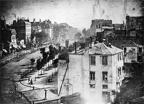
Jumping ahead 250 years, and we’re to the logical conclusion of representing the visible world: photography. The function of painting was suddenly questioned, as a new set of tools superseded the need for paintings—if all paintings were for was representing the world around us, why make them anymore? A 100 year period of angstful contemplation unfolded, resolving more or less with a urinal, and a Brillo box, among other things. Photography caused artists to question everything about painting: its tools, its processes and its purpose. This isn’t to say painting is no longer relevant, but that it went through a long period in which it was a set of technologies in search of a new purpose. Yet people continue to paint, and if you consider a broader range of subjects, paint with very similar goals—representing the visible world—with tools not so different than those Cimabue and Giotto used 700 years ago.

Let’s look at one more example of creative technologies: those of hip hop. The tools of hip hop have changed over the last 40 years, but they have also stayed the same: tools for cutting and mixing. Hip hop emerges from the NYC street party scene where DJs were developing ways to keep a party rolling without stops between songs. This may seem like an oversimplification, and it is, but the fact remains: hip hop music initially emerged as a means of keeping a party going.

The tools of the trade were two turntables, a mixer, a microphone and crates full of records. The DJs up in the Bronx figured out how to use two copies of the same record to create extended versions of a song, and to overlay pieces of two songs to create a new one, or simply to create a bridge from one song to the next. In the process, DJs discovered that their turntables weren’t just playback devices, they were instruments in their own right. They could be played to create new sounds out of the pre-recorded tracks.

These base technologies were supplemented with things like reel-to-reel tape machines to allow DJs to record mixes ahead of time so they wouldn’t have to always perform everything live. And there were digital tools like the drum machine and the sampler. Drum machines made it easier to replicate a great break, or create a new one. And samplers brought the storage and processing capabilities of computers to make it easier to build songs out of the pieces of other songs.

But at the end of the day, the point of all this music and its tools was keeping a party going. The tools of hip hop have changed over the last 40 years, but they have also stayed the same: tools for cutting and mixing. As this hip hop example points out, the history of creative technologies is often a history of exploration. By that I mean artists and designers are simultaneously pursuing creative goals and testing the potential the tools at their disposal to see what new expressive and experiential goals they discover.

In many ways, this class is not so different than what DJ Kool Herc, Grandmaster Flash, African Bambara and Grand Wizzard Theodore were pursuing in the parks and clubs of the Bronx. In this class, you all are exploring the potential of your toolsets to create music. The differences lie in the contexts for sure, but also in the technologies you are using to create. Instead of mostly physical tools—turntables, mixers, and records—you are using the more language-based technologies of programming and music theory.
McCloud's Six Steps

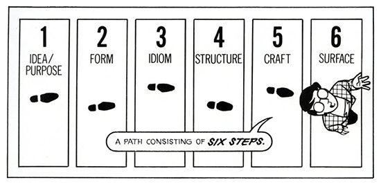
It’s hard, isn’t it? One of the best descriptions of the challenges of creativity I’ve ever found comes from Scott McCloud’s Understanding Comics. He describes a six-part journey from being a fan to becoming an artist. Though he doesn’t frame it this way, he is telling the story everyone goes through in mastering the technologies of their craft.

We begin with imitating the surface details of the given medium. We try copying the methods we know or imagine are used to create work in the medium. This is often about mastering the basic technologies of the medium—drawing with pen and ink, strumming a guitar, writing basic programs.

At some point, we get a handle on this, but we also begin to see there is much more than just knowing how to use the tools. There are all sorts of invisible technologies of knowledge we need to understand—color theory, geometry, musical scales, chords, and so on.  These invisible technologies are the basic principles governing the medium.

Then we realize there is another level of craft—that of the medium, and the underlying language of the medium. In comics, that might be the frame, in music, time signatures, chorus-verse structures, and so on.

Once we understand that language, we find there are more nuanced idioms that allow more fine-grained communication through the medium. The conventions of genres, which applies to music and comics alike.

After all that, we’ve come to master four successive layers of technologies: the basic craft skills, the principles that guide those skills, the principles of a medium, the particular language within the medium. And at this point, we are kind of back where we started, but with a more confident set of skills for using a set of technologies that allow us to create in ways we otherwise could not. We still have those nagging questions, though. What do we have to say? What do we need to express? And why this set of technologies? How are they strengthening our abilities in ways others could not?

This journey to mastering a craft isn’t easy, as you all well know. Ira Glass, host of the radio program This American Life, has a great quote on this that I’ll end with:

“Nobody tells this to people who are beginners, I wish someone told me. All of us who do creative work, we get into it because we have good taste. But there is this gap. For the first couple years you make stuff, it’s just not that good. It’s trying to be good, it has potential, but it’s not. But your taste, the thing that got you into the game, is still killer. And your taste is why your work disappoints you. A lot of people never get past this phase, they quit. Most people I know who do interesting, creative work went through years of this. We know our work doesn’t have this special thing that we want it to have. We all go through this. And if you are just starting out or you are still in this phase, you gotta know its normal and the most important thing you can do is do a lot of work. Put yourself on a deadline so that every week you will finish one story. It is only by going through a volume of work that you will close that gap, and your work will be as good as your ambitions. And I took longer to figure out how to do this than anyone I’ve ever met. It’s gonna take awhile. It’s normal to take awhile. You’ve just gotta fight your way through.”

The moral of this story? Though it probably seems like it, the technology isn’t the hard part. It is knowing what to do with the tools that is the real challenge.

The more we can focus on what we’re making, and why, the less mysterious technology becomes.
Rendering Meaning: On the Intersections of Visual Style, Interactivity and Gameplay

The following essay is based on a talk I gave on February 6 at College Art Association’s annual conference. It was part of “The Visual Politics of Play: On the Signifying Practices of Digital Games” organized by Soraya Murray. My talk wandered off the panel topic a bit, looking more at the challenges of critiquing games that fall outside traditional gameplay expectations.

—————–

Over the last few years, I’ve increasingly felt the need for a more inclusive aesthetic framework for considering videogames. More specifically, I seek an aesthetics that takes into account play experiences that go beyond typical player expectations: the pursuit of goals, the exploration of the space of possibility in a game, and winning, and so on. Some of this thinking is captured in my book, Works of Game, released last year, and Fun, Taste & Games, a book I’m currently writing with David Thomas.

Today, I would like to set out on a new path within this project—exploring evaluative approaches for games where the play emphasizes sensory, thematic or affective experiences that bend and break videogame tropes. I’ve picked three games to use as case studies today—Tale of Tale’s Sunset, Cardboard Computer’s Kentucky Route Zero and Eddo Stern’s Vietnam Romance. In each case, the gamemakers combine videogame technologies and game design tropes with literary, film and visual art strategies to create sensory-driven play experiences.

Sunset

Sunset
First, Tale of Tales’ Sunset from 2015. The player guides Angela, an ex-pat African-American woman living in a Latin American country roiled in civil war. Her job is your job: housekeeping for a wealthy man. The game consists of 44 late-afternoon visits to the apartment. Each day, Angela is given a set of tasks to accomplish—unpack a box, clean the kitchen, wash windows, vacuum the floor. The player has until the sun sets each day to complete her tasks. At the end of the visit, Angela returns to the elevator, and the game advances to the next housekeeping appointment.

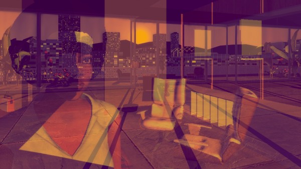
The game is played from a first-person perspective, meaning we never really see Angela outside her reflection. We never see the owner of the apartment either, leaving the apartment itself and the city outside its windows as the primary visible characters. The carefully-designed and decorated 70s bachelor pad Angela maintains is represented in a “videogame realist” style balanced between game engine realism and a sculptural stylization just this side of the uncanny valley. The environments and objects—pillows, plants and rugs alike—all have that hard-surface look of 3D, belying their creation by meshes overlaid with images. In contrast, the perfectly-emulated cinematography of the game engine reveals a world awash in warm, dusty sunlight. This sets up a visual tension—the stylized, quasi-realistic modeling of the world is viewed through photo-realistic cinematography where light refracts just-so off polished furniture, and ghostly reflections shimmer in windows.

The play experience of Sunset operates in a middle ground of audience expectations. It is presented in a typical first-person, three-dimensional manner that suggests real-time engagement in which the player sees through the character’s eyes, and by extension, performs in-game tasks as the player. But in Sunset, the player navigates Angela to the room where the task is to be completed, and once the player locates the site of the task, she simply has to click on the appropriate space or object, and the task is complete.

Instead of transposing the act of sweeping or plunging or washing into actions performed with a game controller, the player simply clicks, at which point the view shifts to the glimmering evening sky as the clock shows time rapidly passing while the task is presumably performed off-screen. This can be read as Angela’s own focus during her chores—she tunes out and daydreams, with little active mental attention required to carry out tasks she has done over and over during her time as a housekeeper. The extra-mimetic nature of the interactivity also relocates the core play activity from performing intricate tasks to moving and seeing. In the realm of 3D games, the acts of seeing and moving are so commonplace as to not be considered game actions; in Sunset, this extra-mimetic treatment of the tasks the player is asked to perform shifts the focus of the experience from goal-completion to a more atmospheric story experience.

There are two additional “videogame easy” actions available to Sunset players—listening and examining objects. As Angela rides the elevator up to the apartment each day, she receives her list of chores, while we hear her thoughts, which tend to focus on snippets of current events relating to the war, and details from her own life and that of the apartment owner. Angela encounters various objects as she moves around the apartment—magazines, records, artworks, papers. Some of these objects trigger additional commentary by Angela, here presented as text. Angela’s verbal and written commentary become the primary vehicle for backstory and interpretation.

Despite the goal-oriented premise, Sunset is more atmospheric than mechanical, and more concerned with a sound and audio-driven story experience than goal-oriented achievement. This is a far cry from most videogames set in times of war—instead of focusing on combat, Tale of Tales looks at how a time of conflict impacts the quotidian.

Kentucky Route Zero

KRZ_conclusion

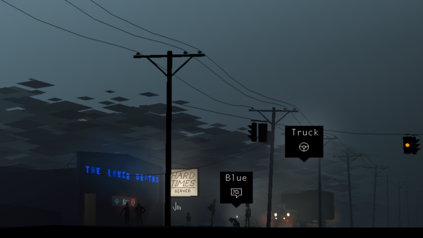
The second game I’d like to look at is Cardboard Computer’s Kentucky Route Zero, a game in five acts, the first three of which were released in 2013 and 2014. The game augments the traditions of the point-and-click adventure game genre with a keen cinematographic eye, while stripping away the puzzles typical of the genre. Players follow Conway, a truck driver, as he attempts to deliver antiques in the backroads of Kentucky. As was common for point-and-click adventure games, scenes are presented as deep-focus middle shots that establish context and characters, and are the stage on which scenes unfold. Moving Conway, and on occasion, other characters, is the core interactivity. Typical for the genre, this is accomplished by clicking on the place the player wants the character to move.

Much of the game’s beauty comes from its visual and cinematic style. Flatly colored, stylized figures, objects and spaces are composed from planes of geometric color, together generating a flat, two-dimensional pictorial space. The only nuance and shading comes from the lighting sources, which also provide the primary indicators of depth in the environment. Though subtle, the camera work is precise, feeling more like carefully composed cinematography than what we might expect from a point-and-click adventure game. This happens largely through the decoupling of the camera from the player, allowing a more deliberate composition, framing and movement.

The camera movement also suggests a depth in the seemingly two-dimensional world. The game is indeed three-dimensional, organized along a series of planes within a shallow stage-like space. The camera tends to track Conway’s movement and the action in general—panning left if he goes left, zooming in slightly if he moves away from the picture plane, tracking him if he moves upward. The camera movement causes parallax effects that give the game a quiet cinematic lushness.

Changes in scene are indicated by small directional prompts. The typical design decision would be to allow the player to make these changes by clicking on a door or ladder or otherwise abstract the passage from scene to scene through an in-scene interaction, like clicking on the door to indicate Conway should pass through it. But in Kentucky Route Zero, these choices are moved into super-imposed interface elements.

Similarly, there are interface prompts for three additional activity types: “look,” which provides a more detailed written description of a person, object or animal; “talk,” which opens text dialog trees; and “use,” which can mean different things depending on the item: pick up, drive, turn on, and so on. The text trees through which conversations and verbal actions occur are the source of much of the story progression. Decisions are made, situations worked through, backstory explained, and most importantly, the main through line—Conway finding his way to his delivery destination—unfolds through these conversations.

The most curious of these is “looking.” Instead of allowing the player to zoom in on a detail, something fairly commonplace for examining objects in games, players are instead given a written description. Often, the description fills gaps in the level of visual detail—letting you know a chair is a Queen Anne, or the condition of Conway’s dog’s hat. Other times, these indicate activity.  These descriptions are presented parenthetically like the stage direction one might find in the script for a film or a play. These descriptions also deepen the style and tone of the game tone.

These two devices—overlaid selection menus and the use of text for description and dialog—engages the player while keeping them at arm’s length from the story and characters. We never become Conway, even if we get to decide where he walks and what he says. We are participants in establishing the tone and tenor of the game, but we are not an actor within the game.

Unlike many videogames, Kentucky Route Zero has no pretense for immersion, instead opting for absorption. Most everything about the game establishes a carefully-controlled play experience that can be like the best of film or literature—allowing the player to become absorbed by the authored experience.

Vietnam Romance

Vietnam Romance

The last game I’d like to look at is Eddo Stern’s Vietnam Romance, a game still in development, though it has been displayed on several occasions including a solo show at Postmasters in New York this past summer. The current state of the game is a series of nine vignettes, primarily constructed from the conventions of side-scrolling games—driving a car, flying a plane, shooting an arrow at a distant deer, catching objects thrown from a vehicle ahead on the road, and so on.

Woven through the scrolling levels is a collectible card game. The cards represent the resources necessary to carry out the actions of the game. The play experience then unfolds as the player navigates while pausing on occasion to collect, examine and “play” cards.

Early in the game, “If you hated the War but liked the Movies, you’ll love this Game!” scrolls across the screen. This seems like a glib joke, but it is key to making sense of the game. Vietnam Romance is a playable meditation on American cinema’s romanticization of the Vietnam War.

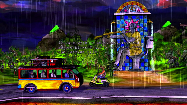
The most striking thing about Vietnam Romance is its visual style, and how it is creates the play space. The graphics are all hand-created watercolors mapped onto extruded shapes. This creates a sense of depth with the overall effect of watercolors affixed to black foam core arranged on flat planes receding into the middle distance. The clearly hand-made style created from saturated colors create a striking play experience that feels less like a videogame than a playable diorama.

It may well have been easier for Stern to use a more realistic, three-dimensional style, but that would have likely led to the game reading as a typical war simulation. And so the watercolored diorama creates a necessary distance, allowing us to consider a different aspect of war.

Similarly, the move away from first-person aiming and shooting or the strategic deployment of military forces are set aside for set pieces inspired by films like The Deer Hunter, Full Metal Jacket and Apocalypse Now and the Vietnam War tourism phenomenon.

The activities in these set pieces vary widely—puppeteering a Nancy Sinatra-meets Full Metal Jacket dancer; taking an aging Rambo-esque fellow deer hunting; catching playing cards thrown from a ox-drawn cart; shooting letters out of karaoke lyrics, and so on.

The curious thing about some of the set pieces is their pressure on player skill. Many require a mastery of videogame actions. For example, the opening driving scene becomes a resource management puzzle to keep the beaten up car from overheating, while the deer hunting scene demands a keen spatial understanding coupled with precise trajectory calculation. These are akin to carnival games, as they test the player’s skill, but ultimately do not thwart the overall play experience—the player can simply give up, and resume the vignette, or return to the menu to play a different vignette. The game becomes an amusement park cars-on-a-track ride exploration of videogames and American cinema as much as it is a look at Vietnam War nostalgia.

Challenges for an inclusive aesthetics
Looking at these three games, we see different approaches to bending and breaking videogame genre expectations to create expressive play experiences that largely stay away from goal achievement and systems-driven interactivity.  This presents a challenge for analysis and critique: if these games meld sound, image, story and repurposed game tropes to construct play experiences, but ignore most all other expectations of videogames, can we still evaluate them using the critical language of videogames?

Even at their most inclusive, the theoretical frameworks of game studies and digital media can fall short. Take Janet Murray’s defining characteristics of the digital medium: procedural, participatory, encyclopedic and spatial. As Murray’s theory is generally interpreted and applied, the presumption is that videogames should push these properties to their logical extensions, meaning player interaction should lead to unexpected outcomes within the designed space of possibility. Sunset, Kentucky Route Zero and Vietnam Romance are indeed inside Murray’s boundaries, but they use the digital medium and videogame tropes for authorial expression that is light on interactivity as authorial agency.

This leads to the consideration of the importance placed on choice and decision-making. The concept of meaningful choices has long stood as a defining principle of game design. This perspective is best embodied in game designer Sid Meier’s definition of a game: “A game is a series of interesting choices.” which places value on players having an active role in determining the outcome of the game. From this vantage, Sunset, Kentucky Route Zero and to a lesser degree, Vietnam Romance, fall short, as there is a presumption that interesting choices give players systemic impact on the quality and quantity of the play experience.

This points to the value placed on games as dynamic systems. Videogames are approached as interactive systems within which players can tinker and pursue measurable outcomes. In these three examples, the systems dynamics tropes are for the most part replaced with structures of progression rather than emergence, to borrow Jesper Juul’s terms. For these games on the margins, it is necessary to see the systemic confluence of visual and aural elements, interactivity and theme and not just on state changes.

This suggests another early theoretical framework—Espen Aarseth’s nearly 20 year old theory of ergodicity. As Aarseth defines the term, “… nontrivial effort is required to allow the reader to traverse the text.” Aarseth’s example of trivial traversal is the act of reading a book—assuming one knows how to read, and is familiar with a given culture’s conventions for navigating pages and their sequencing, reading requires minimal effort, and thus is non-ergodic. Aarseth’s ergodicity has been broadly interpreted to speak to the player’s agency in shaping the game text through in-game actions. But in games like Sunset and Kentucky Route Zero, player actions are mostly the equivalent of reading and page-turning, at least from a vantage that privileges meaningful choices within a systems-driven space of possibility.

The reception and literacy side of these experimental works cannot be taken for granted, however. Each of these three games make demands on players that at once requires gameplay literacies and an openness for experiences partially outside videogame conventions. Tale of Tales’ Sunset asks us to understand and master the basic interface of a 3D first person videogame—look and walk. For gameplayers, these have become trivial, but for those who might have more affinity for the subject matter but aren’t gameplayers, this basic expectation is a barrier. Vietnam Romance is also instructive here—the deer hunter / Rambo vignette requires a surprisingly sophisticated ability to estimate distance and trajectory across a long distance. We find a tension point here for developing more inclusive critical frameworks—one player’s nontrivial is an another player’s rote and commonplace.

If we re-orient our focus toward a more experiential set of player choices, the real value of these games becomes clear. Aarseth uses labyrinths and mazes to tease out the differences between ergodic and non-ergodic literature. Unicursal labyrinths involve movement through an ultimately linear path absent of decision points. Multicursal mazes require decisions at forks in the path which have a substantial impact on where the experience goes. The presumption is most ergodic texts are multicursal. In our three examples, they generally don’t present multicursal “meaningful choices” that drive toward goal completion or quantifiable outcomes with win and lose states.

But if we shift this from a valuation of a player’s exploration of a space of possibility to the experiential choices a player makes—peer out the window at the city sky, pat a dog’s head, wonder at amusements from a slowly moving car—these games present meaningful experiential choices within a unicursal play experience. Analyzing and critiquing games like Sunset, Kentucky Route Zero and Vietnam Romance requires we break from the systems-driven, goal-oriented evaluation of player activity. The roles of player agency and decision-making have to be re-located to support the value of lighter player impact and heightened authorial expression.

At this stage in this project, I’ve only scratched the surface in sketching out the issues in creating an aesthetic framework that values experiential play experiences, and I am raising more questions than I’m answering. Hopefully, though, I’m starting to reveal a path toward a more inclusive videogame aesthetics.

The Author is Present

With anna’s upcoming exhibition, “the road to empathy” opening tonight at babycastles (which I interpret in part as a wake for dys4ia), it seemed like a good time to publish this essay. It is an in-progress excerpt from Fun, Taste & Games, a book I’ve been working on with David Thomas that we hope to release later this year.

—–

anna anthropy’s dys4ia, The Chinese Room’s Dear Esther and Zoe Quinn’s Depression Quest sit alongside a handful of other games that serve as exhibits in the trial-by-Twitter about what games are, can and should be. Much of the controversy relates to how the games are considered from the perspective of dominant ideas about game design. Particularly commercial games, the dominant presumption is that players have agency within the designed space of the game. This has become as central to evaluating games as the role of story is for film—films have stories, games have player agency.

How a gamemaker chooses to engage with the elements of game design—player actions and goals, the space of possibility for player performance, the visual and sound elements, the writing and the story—these are all design decisions. So too is the choice to not use these elements. Indeed, acts of omission are far more important decisions in the creative process than those about what to include. In music, it is the space between notes, the choice of which instruments to use and those to set aside. In film, it includes the decisions around which moments in the characters’ lives should be explored, and which should be left out. In painting, it can be the decision to work abstractly instead of using color and line to represent the world.

Expectations build up around mediums, and artists and audiences alike make assumptions about what ought to be part of works in a given medium. dys4ia stands as an example of a game that purposely resists and plays with our expectations. It is a game designer’s game; it belies a deep, intuitive understanding of the conventions of game design. It also plays with and breaks conventions to expressive ends. In an era when “game” stands in as another product category for disposable entertainment, dys4ia challenges assumptions. But in the context of personal work—Marjane Satrapi’s graphic novel Persopolis: The Story of a Childhood, Gob Squad’s experimental theater piece “Western Society” or Marina Abramović’s performance art piece The Artist is Present—the game also shows us a way games are like other expressive artforms. Like these works, the emphasis is place on authorial experience, not audience performance (even, as in the case of the Gob Squad and Abramović, there is audience participation).

dys4ia is not limited by traditional ideas of gameness. dys4ia isn’t an attempt to make us understand anna’s experience, or to make us more empathetic. The game is a way for anna to make sense of a particular moment in her life, and perhaps to share it with others with similar experiences. The player is separated from the game in two ways: the intimate yet alien act of playing within another person’s experience, and through the distance of time.

dys4ia is a work of ludic literature. It is a playable diary, as Paolo Pedercini and others have noted. Or, as anna probably puts it best, a game journal. Our role is not to play in order to make the moments our own, but to play so we can receive anna’s story. It is a story unfolded through play in the sense of mechanical engagement with an authorial intentionality we might align with poetry—most following poetry don’t view the works as “for them,” but rather created as an expression of the poet. To think of games as solely a space for player performance inside a design is to tragically limit games. dys4ia shows how an ever-present author is equally important. More than that, it is an ever-present author in a past moment. dys4ia explores anna’s experience before and during the game’s creation, in the same way a diary captures the time around its writing.

The game’s space of mechanical possibility is narrow. This makes sense, as the game is about anna’s experiences after all, not the player’s. When we play dys4ia, we aren’t role-playing or engaging with a rhizomatic play machine, nor are we exploring an imaginary place and its inhabitants. The vignettes are shaped more like memories or dreams than anything else—distillations of meaningful life experiences.

The game is composed of four chapters, each focused on a particular period during anna’s experience around hormone replacement therapy. The chapters contain a series of short entries or vignettes exploring a particular experience or feeling. The use of Warioware-esque mini-games to construct a series of ludic vignettes gives a flexibility within a structured whole. Within each vignette, anna could use the appropriate gesture while still letting it fit within the four-chapter structure. Sometimes, the vignettes reference games like Breakout or Ms. Pac-Man (or its many themed clones). Sometimes they borrow from matching games. The interactions performed by the player within each vignette illustrate a thought, an experience, a decision.

One of the more striking appears three times, once at the beginning, once in the middle and once toward the end. In the first instance, the player is presented with a puzzle piece, and a wall through which it must pass. Using the arrow keys, we move the piece along. At first glance, the piece seems like it won’t quite fit, even though it is exactly the shape of the hole. Careful navigation allows the piece to enter the gap, bringing up the first passage of text, “I feel weird about my body.” The role of the player in anna’s story is made clear, as is anna’s state of mind about her body. In the same way a comic artist might use metaphor to visualize an idea, anna uses an interactive gesture to illustrate a moment in her experience.

One of the things that first struck me about dys4ia was the clever dissonance between the graphics and the subject matter. The relationship between the visual style and anna’s story brings a poet’s sensibility to the game. The stylization of the people, places and objects brings clarity and focus, but also a particular feeling to the play experience. The same extends to the play itself. When we think of something as deeply personal and challenging as gender transitioning, bright, simple pixel graphics probably aren’t the first style that comes to mind. Lo-fi pixel graphics are more often associated with fluffy and ephemeral, not personal and painful. This stark contrast works well for the game, bringing clarity and force to anna’s conveyance of her experience. But it also speaks to the zinester community and its embrace of “craptastic” visuals and audio as a critique of craft and technology barriers keeping more people from making games.

The language in the game is kept brief and to the point. It is there to underline the ideas more than present them. I say this because the images and interaction often make the idea, event or experience clear. The text’s display is often used to give more nuance to the vignette and to serve as feedback on the player’s actions. In the first chapter, one vignette presents the player with a silhouette of anna trying to put on a tight-fitting shirt. “Girly Clothes” appears at the top of the screen, providing context for the player action—repeatedly clicking the down arrow to pull on the shirt. After a number of clicks, “don’t fit” appears at the bottom of the screen, emphasizing the point, but also confirming the player’s experience.

A couple years after dys4ia was released, I encountered another work of a woman’s experience with gender transition—Transgender Dysphoria Blues by Against Me!. Like anna anthropy, Laura Jane Grace, the band’s lead singer, used the album to express aspects of her experience with transitioning to openly living as a woman. Songs like the eponymous “Transgender Dysphoria Blues” operate inside the idiom of the pop punk metal-tinged subgenre. At first listen, if you don’t pay attention to the lyrics, you might not think anything unexpected is going on with the song. The lyrics, however, suggest otherwise:

You want them to notice,

The ragged ends of your summer dress.

You want them to see you

Like they see every other girl.

They just see a faggot.

Listening to the song as a whole, lyrics and all, you can hear frustration and pain conveyed in a way that came natural to Laura Jane; she works from a place of artistically familiarity—guitar-driven punk-inflected rock. But unlike much of the band’s earlier music, there is a heartfelt, personal feel to the song. Laura Jane works through her experiences, feelings and desires, but doing so in the form she knows best. anthropy’s creation of dys4ia strikes me as similar in many ways—an artist working within a medium she knows well to share her experiences.

One striking difference between these two works is how they operate within their given mediums. “Transgender Dysphoria Blues” as a song doesn’t depart from the style of Against Me! in any meaningful way beyond the lyrics. Being someone who doesn’t always pay close attention to lyrics, I’m not sure I even noticed the subject of the song at first. But with dys4ia, there is a reimagining of the form of games. anna composed from the materials of games—more often considered a form of entertainment—as a means of self-expression and exploration. In the process, she gave shape to something new: a game steeped in the history of games, but still unexpected in its use of the form.

Transgender Dysphoria Blues did create some controversy, but it was largely accepted and people moved on. The form of pop-punk was not the controversial aspect, after all. That dys4ia created (and continues to create) a ruckus speaks to the limited conception of games that we operate under. dys4ia, Depression Quest and Dear Esther continue to serve as mile markers in the maturation of games as a medium—in their reception and the way we think about what games can be. For me, they are clear signs of the medium of videogames broadening, becoming more flexible and embracing. That these games receive so much scorn is a sign that they have hit a nerve well worth striking.

Mediums, Media, Culture and History

Albrecht Dürer, The Ravisher

Albrecht Dürer, The Ravisher. Baillieu Library Collection, The University of Melbourne

Last night, my Twitter feed burst with anger about The Entertainment Software Association’s position on the preservation of “abandoned” videogames. Apparently, the ESA, the trade association of the major videogame publishers, believes the preservation of “abandonware” videogames—games that are no longer supported, manufactured or otherwise published— is a form of hacking. And, in the ESA’s eyes, all hacking is a form of piracy.

Perhaps the greatest irony here is the use of the term, “hacking.” The logic I’m sure is to play on the negative connotations around black hat hacking—the kind that leads to databases full of credit cards being stolen and Sony’s email littering the internet. Hacking used to not mean internet malignancy, not by a longshot. Back in the 50s and 60s, to hack was to do something new and cool with technology—“expensive typewriter” was an early hack to make massive mainframe computers function as a typewriter, for example. It is this flavor of hacking that led to the creation of the earliest videogames. Spacewar!, for example, was a 1962 hack of the Digital Equipment Corporation’s PDP-1. Steve Russell and his friends built and iterated on the game, slowly pulling together their dogfight-in-space game. Before Spacewar!, there was Tennis for Two, Willy Higginbotham’s 1958 tennis game hack of an analog computer designed for simulating missile trajectories. And in 1952, A.S. Douglas created a Tic Tac Toe hack, OXO on the EDSAC. The big difference between mid-20th century hacking and the sad state of affairs today? Tic Tac Toe, Tennis for Two and Spacewar! were all created outside the confines of intellectual property laws and the tangled mess that is media-based creativity.

This is not a new problem. For as long as there has been mass-production, there have been attempts to protect creative work. The oldest example I know is from the early 16th century—the German artist, Albrecht Dürer. Dürers paintings were works in the medium of painting, while his prints were a form of proto-mediamass produced image products. His paintings were part of the ongoing dialog amongst Dürer, those who commissioned paintings from him, the institutions in which the paintings were hung, his fellow painters, those who wrote about his work, etc. In other words: the cultural infrastructure that swirled around his work. If you look at a book about the Northern Renaissance, youll quickly note a few things: there were only a few viable subjects (e.g. the Virgin Mary, baby Jesus, saints, portraits of the wealthy and powerful); many of the works are incredibly similar in composition, size color palette, painting technique, etc.; and Dürer seemed to be a trendsetter and follower all at once. This is how material culture always works: there are conceptual, formal and experiential expectations around what a medium is and isn’t good for (I talk about these ideas in more detail in the first chapter of Works of Game).

Dürer was nothing if shrewd. He was quick to adopt printmaking as a new outlet for his work. In printmaking, the artist found both a new audience and a means of self-promotion. He could create prints based on his paintings in order to spread word about them, and he could create original prints that could be sold to a less affluent audience. Soon enough, copies of his prints began to appear on the market without his authorization. He was outraged, and sought to protect his work and, in today’s terms, his brand. What we see happening with Dürer was the transition from a medium to media. Painting was a medium in the same way as sculpture and drawing. Because of the resources, time and skill it took produce a painting (or sculpture or drawing), copying was a concern. But with printmaking, where a single image could be reproduced hundreds of times in short order, the dissemination of works was much easier. Printmaking was a media, and therefore changed the ways artists thought about the intellectual property of their work.

Fast forward to the mid-to-late 20th century, and we see what in the past we might have called a medium immediately transform itself into media—software. Certainly, software wasn’t the first medium born into media status (film, television, radio), but the change in perceptions of software were swift and fairly merciless. By the 1970s, barely a decade into the commercially-viable life of computing, software was already a widget to be up-sold with computers. (Walter Benjamin’s “The Work of Art in the Age of Mechanical Reproduction” is a much more detailed and insightful exploration of the role of technology in changing perceptions about media. And McLuhan certainly has things to add on the subject as well.)

The main concern here is that the operations of creative culture, including the media products created by the members of the Entertainment Software Association, don’t really operate cleanly within the confines of intellectual property and copyright law. These things in fact push against the traditional ways culture is produced. It is a cycle of creation, inspiration, creation, inspiration, and on and on. A clear articulation of this is found in Kirby Ferguson’s “Everything is a Remix” series. Videogames are no different. Think no farther than the genre similarities we see with action-adventure games (who all seem to star variations on a unshaved white guy theme, or shooters with nearly interchangeable weapons, maps and bad guys). It is how culture works. The same happens with movies: how many super heroes will save the world and aging white guys will rescue their daughters this summer?

When trends and mediums pass, history becomes the way we preserve and remember what has come before. Often, this ends up feeding back into the current culture. Subculture fashion is an obvious example—80s recycling of the 50s, 90s recycling of the 70s, 00s recycling of the 80s, 10s recycling of the 90s. Videogames, particularly indie videogames is another, with the insatiable love for NES-era graphics and the never-ending stream of golden era arcade reboots. Videogames in particular and software more generally are challenging to preserve. Unlike Dürer’s paintings, you can’t simply put them up on the wall under controlled lighting and humidity and call it a day. The games require their platforms, period monitors, the parts to keep the platforms running, etc. For institutions like the Museum of the Moving Image and the National Museum of Play, which try to present games on their original platforms, there is untold work and expense to pull this off. It is easier to preserve the ROMs from old games that can be run on emulators. That’s what we had to do when we exhibited Spacewar! in the “Video Games Blast Off” exhibition at the Museum of the Moving image, as it was simply too costly to have a functioning PDP-1 (only one known in operation out at the Computer History Museum, itself made out of the parts of three machines), so we worked with a preservationist to create a facsimile of the computer’s hardware, and ran an emulator for game play. (Every other game in the show ran on its original hardware.)

But beyond the challenges in preserving videogames and their platforms, there is the lack of support around this work. Much of the cultural heritage field (e.g. art museums, the Smithsonian Institute, the Library of Congress, archeological and anthropological institutions, etc.) is viewed as important and thus worth the resources necessary to conduct the important preservation and historical research. Software preservation is far behind that of many other forms of material culture preservation, largely because sufficient philanthropic and public money isn’t being directed toward the ongoing efforts.You would think ESA would provide money toward these initiatives, or encourage its membership to do so. But thus far, that hasn’t been the case.

Given this, the bulk of the work to preserve the history of videogames comes from fan preservation efforts. These efforts rely on passion, disposable income, eBay, and more often than not, ROMs and platform emulators. And this is what the ESA is calling hacking, and therefore piracy. 

I realize I’m deeply biased in my opinions about the importance of material culture histories, but I find the ESA’s position to be ridiculous, callous, and so clearly about the profit margins of its membership that it barely merits mention. And if I think about it for a moment, there is nothing surprising about this. The videogame industry is deeply uninterested in its past for any reason other than mining the nostalgia of its fan base for profit. Though the fans place emphasis on the videogame portion of “videogame industry,” the companies producing the games clearly put industry first—they might as well be selling razor blades. For the large companies paying dues to the ESA, a game on an obsolete platform is irrelevant. Why care about something that can’t be monetized? Or more importantly, why allow anyone to play it until the port to the current generation of platforms is complete? The more easily players can access ROMs for abandonware, the less profit potential there is for the release of games on Steam and iOS.

This model is nothing new. Disney perfected it with the periodic re-release of its classic animated films, and the tightly-controlled release in emerging media and platforms. Disney, however, is wise enough to see the value in letting cultural heritage professionals do the work of preserving Mickey, Minnie, Cinderella and all those cats, dogs, mice and other creatures. Let’s hope the ESA and its membership eventually wake up to the fact they produce culture, not just products, and that they benefit from the preservation of their products by allowing them to be preserved and studied. 

What Yvonne Rainer taught me about experimental game design

Yvonne Rainer dancing

All the turbulence around games and the increasingly diverse range of opinion on what is or isn’t a game, and what does or doesn’t constitute game development leads me to a fairly basic question:

What do we mean when we talk about game design?

Is it the design of spaces of possibility defined by the mechanics and fueled by the goals to which they are applied?

Is it the use of participatory storytelling to deliver personal narratives?

Is it something more ethereal, like the creation of potential emotional states?

Is it a tool for self-exploration and expression?

The more diverse games become, the harder it is to see one “game design” that unites them all. As we’ve cycled through a variety of movements from artgames to notgames to queer games to altgames, each has brought its own claims on the medium of games, and in turn caused reactionary territorial defensiveness. Artgames suggested games could be more than entertainment; notgames challenged that games had to be competitive, goal-oriented and mechanically rich; queer games brought a whole new set of values, perspectives and stories to games; and most recently, altgames question the assumptions of what indie means, and how games can be a sustainable medium. With each of these, particularly the latter two, there are always power politics at play over whose voices are heard and celebrated, and who has access to infrastructure and thus audiences and resources. But in all four of these cases, considered from a practitioner perspective, these debates come down to what we mean when we talk about game design.

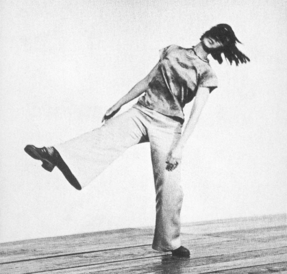
A couple weeks ago, I found a handle to these questions in an unexpected place: the minimalist choreography of Yvonne Rainer and her colleagues in the experimental dance world of early 1960s New York. Under the guidance of the dancer and choreographer Merce Cunningham, the musician and choreographer Robert Dunn and the musician and artist John Cage, dancers, filmmakers, musicians, writers and other artists explored what lay beyond the current state of dance. Rainer and the group of like-minded practitioners formed the Judson Dance Theater as a stance against the then-dominant modern dance typified in the work of Martha Graham. Though a departure from traditional ballet in subject matter, costume, set design and many other ways, Graham’s canonical modernism, typified in “Appalachian Spring,” also stayed firmly inside the boundaries of dance—highly stylized movement distinct from the movements of everyday life, the repetition of forms and movements, an overt sense of drama,  designed to accompany melodic scores, among other similarities.

Graham’s choreography represented all the problems with dance for Yvonne Rainer. To express her ideas, Rainer wrote the “No Manifesto”:

No to spectacle.

No to virtuosity.

No to transformations and magic and make-believe.

No to the glamour and transcendency of the star image.

No to the heroic.

No to the anti-heroic.

No to trash imagery.

No to involvement of performer or spectator.

No to style.

No to camp.

No to seduction of spectator by the wiles of the performer.

No to eccentricity.

No to moving or being moved.

Though it might seem otherwise, these ideas were not anti-formal; in fact, they were the opposite. They were deeply concerned with dance as a cultural form, despite the rejection of the pervading aesthetic of the time. Rainer sought to re-locate the intent of the choreographer from the traditions of dance as a professional practice isolated from life to what she called “ordinary dance.” This wasn’t a dismissal of dance as a medium; it was a reassessment of dance as a more-human scale medium concerned with the movement of the body and not the baroque, contrived movements of previous dance traditions.

At the heart of Rainer’s work is the question of intent: what does it mean to choreograph dance when so many of the traditions no longer apply?

The embodiment of these beliefs are found in “Trio A,” a minimalist dance choreographed in 1966, shortly after the manifesto was written. The six minute dance is made up of a sequence of non-repeating movements that draw on the movements our bodies make in the process of work, play and the mundane. Everyone had a virtuosity with these movements, but a virtuosity developed through living, and not through art.

“Trio A” had style—an anti-style, but a style, nonetheless. Walking, swinging arms idly, hopping, slouching shoulders, rolling over—the movements and gestures that we perform on a regular basis without a second thought—were invested with new meaning, a treated as the elements from which dance could be composed. The style emerged from the choices Rainer made in picking gestures and movements, and how they were sequenced together. The flatness of the dance is also a stylistic choice—to remove intonation and bombast, and replace them with quiet execution.

There was a craft here, too, without question—Judson dancers were notoriously rigorous. But it was toward a different end. It was just not the craft of precise execution of moves drawn from the formal canon of modern dance. It was a craft of seeing and thinking in new ways, and de-training the dancer to move in a new way, to consider a less adorned form of performance. It was a craft informed by art, writing, music, philosophy and many other external influences.

Judson Dance Theater

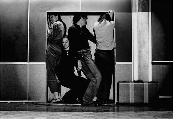
The dance establishment of the time—Martha Graham and other modernists—looked at Rainer and her performers and didn’t see dance at all. I think this is what people used to traditional games, and thus game design, think of when they look at altgames and queer games and notgames: some people standing around in a box and calling it a game. Though it has become something of a dirty word, these are formalist contestations around form, intent and craft.

Let’s pause for a moment and consider these three terms. Often a talisman used to trigger consternation amongst game developers and critics alike, form is just another word for medium: painting, sculpture, film, music, games. Intent speaks to what the artist wants to do with the medium: make money, express themselves, solve world hunger, participate in an ongoing dialog with other practitioners, etc. Craft then is the set of skills necessary to produce work within the given medium that meets the artist’s intentions.

When we talk about game design (or choreography) we are talking about the interplay of these three concepts. We all make assumptions around these, often in the context of our own values and tastes. Pervading opinions take hold and color the way we think about games and their design. Even (especially) indie games are prone to this, setting expectations for experimental approaches to gamemaking.

Indie gamemakers bring a particular set of sensibilities to the form of game, the most dominant being that when we say game, we really mean videogame. Along with this come the privileging of visual polish, mechanical representations of systems, play experiences polished through playtesting, among others. Chris Hecker’s Spy Party and Capybara Game’s Super Time Force represent two examples of this perspective on the form of games.

Along the margins, we see something quite different: personal expression, expanding the range of people who can see themselves in the games they play, pursuing stories drawn from life and fantasy rather than make believe. These lead to radically different kinds of games: Porpentine’s Howling Dogs and Liam Burke’s Dog Eat Dog, for example, that suggest new possibilities for games.

Artistic intent is realized through making, and making requires craft. Now, questions of craft come up with too much frequency around artgames and notgames and queer games and altgames. Certainly, many of the gamemakers within these loose communities of practice do seem suspicious of or uninterested in virtuoso gamemaking, at least in the traditional sense of programming, modeling photo-realistic worlds and game systems brought to a fine sheen through playtesting. That said, there is a deep sense of craft in artgames, notgames, altgames and queer games—on writing, on finding ways to express feelings and ideas that simply haven’t been done before with games, on making games out of “ordinary tools” like Twine or Gamemaker or the other more affordable and accessible tools, on exploring the possibilities of 3D worlds unburdened of guns, puzzles and loot.

We find Twine games like anna anthropy’s Queers In Love At The End Of the World—a 10-second Twine game contemplating the decision of how to engage with one’s partner at the edge of time. While its production wasn’t burdensome, the ideas and experience are nonetheless well-crafted and powerful. Or Robert Yang’s under appreciated Intimate, Infinite, a Unity-built meditation on Borge’s “Garden of Forking Paths.” The game has many of the trappings of a “AAA Indie” production—lush 3D environments, cinematic camera work, cut scenes—but the ways players engage is more cerebral, and less interaction-based.

Like Rainer, there is a certain re-training or de-training at play in these games. But there is also a shift away from the traditions of game development toward the craft skills of other mediums—writing, ‘zine-making, literature, theater, poetry, to name a few. So perhaps instead of de-training, it is better to consider altgames as a reimagining of game design.

All of which comes back around to the form of games. In order to realize the intentions and create new kinds of play for a new audience, games and their design must be reimagined around the intent of the artists, not the expectations of the players. From this broaden perspective, we comfortably locate Squinky’s Coffee: A Misunderstanding and Merrit Kopas’ Hugpunx inside our reimagined understanding of game design.

Rainer’s minimalism, once considered far removed from dance, is now an important pillar in the history of dance. But it took time and dedication. They were continually denied access to the world of modern dance because they didn’t seem to be creating or performing what passed for dance at the time. This put them outside the cultural, social and economic infrastructure of the dance community. So Rainer and her cohorts looked beyond dance for inspiration, and made their own space—the Judson Dance Theater—where they put on free or affordable performances and workshops.

Ultimately, by questioning the form of dance and what it means to choreograph, Rainer expanded the medium. Will the same be true of queer games and notgames and artgames and altgames? One thing is for sure: questioning what constitutes game design is essential to the medium of games, even if it feels like rejection to some, because it broadens the medium for us all.

All that was cited must be linked.

Though Works of Game isn’t quite out yet (updated street date seems to be March 23), I’ve received requests for links to the works I mention in the book. I’ve created a link list of the 98 paintings, sculptures, performances, installations and games I discuss in the book. Some, like NBA 2K 12 and Spelunky are mentioned in passing in the book. Others, like Wolfenstein 3D and Jet Set Willy are discussed due to their use to create other works. A good deal of them are either the subject of the essays or examples used to help us consider games and art in a new light.

It is a pretty amazing list when viewed like this; from Robert Rauschenberg to Super Mario Bros. with a few stops at Cory Arcangel, Mary Flanagan, Brenda Romero and Jonathan Blow on the way.

In any event, if you see any errors or dead links on the list, please reach out and I’ll fix as best I can.


Once the present, now history

WoG

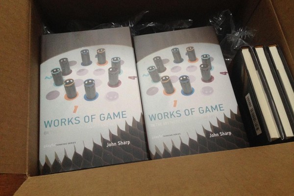
I came home from the Game Developers Conference last week to discover a box full of copies of Works of Game. It was a strange sensation, holding the slim volume in my hand for the first time. Once the excitement of seeing the book in person passed, I began to ponder how, exactly, it took me half a decade to get from proposal to book. (According to my file backups, I began writing the proposal for Works of Game in December 2009, and turned in the final manuscript edits in October 2014, nearly five years later.)

The late 00s were an exciting time in indie games. Numerous breakout hits proved there was a path for indie success, IndieCade and the IGF were attracting huge crowds, and devs were making games that no one would have imagined a few years earlier. But through all this excitement, I noticed some problems. For one, there was the “are games art?” debate that kept popping up despite nearly everyone saying it was an irrelevant question. Coming from the world of art and art history, this conversation always caused my head to spin. More often than not, pronouncements on the subject were made from a point of abject naiveté about what it means to be “art,” to be an artist, and to be part of a subculture that creates, critiques and appreciates art. MOMA’s acquisition of games into the Architecture & Design department only fueled the fire of misinterpretation. Yes, Minecraft, Sim City and Passage had MOMA’s good housekeeping seal of approval, but from the same people who collect lamps and bowls for the museum, and not those who collect paintings and video art. And the Smithsonian’s “Art of Video Games” show toured to great praise, but it was at best vague in its pronouncements of games as art—here meaning well-made, popular media artifacts. And that supreme court decision? That gave games first amendment protections, but it didn’t suddenly declare games art anymore than the first amendment anoints the Beetle Bailey comic strip “Art.”

I also noticed that the contemporary art world, and more particularly the media art community, was largely uninterested in games. Though there have been close to 100 exhibitions around games in museums and galleries, games are mostly treated as either creativity exercises, toolsets with which to make artwork, or cultural tropes ripe for critiques of technology, media and, well, games. But in the post-object, post-conceptual space art now occupies, the ambivalence toward games struck me as a missed opportunity.

It dawned on me that I was in a fairly unique position with games and art—I was a card-carrying Art Historian (at least as far as Indiana University’s Art History department was concerned), an indie dev and a game studies scholar. I began to look more closely at the history of games and art, on the origins of the game industry’s “are games art?” questions, and immersed myself in “game art” (art made of games) and “artgames” (games with artistic intentions). I started giving talks like “Painting with Games: JODI, Julian Oliver and the technologies of game development” at DiGRA 2009, ”Art History for Game Devs” at GDC 2010 and “A Curiously Short History of Game Art”  at FDG 2012. With Ian Bogost and Michael Nitsche, I co-organized the Art History of Games symposium in 2010, and a smaller version in 2013 with Eddo Stern and Melanie Swalwell.

Artgames set the tone for certain corners of the indie scene from 2008 to 2010, receiving all sorts of recognition in the games press and festival circuit. But by 2013, the tide had turned, and it seemed like most of the usual suspects were no longer making work that fit the artgame bill. And examples of game art were few and far between since the heyday of the late 90s and early 00s. What were once of the moment were quickly becoming moments passed, in the process turning two-thirds of my book into a historical analysis. This bothered me, because I wanted the book to be part of an ongoing conversation, and not an art history book. But as much as I understood the artgames scene and the games it produced, and I understood game art and its role in contemporary art, there was still a lot I was sorting out. I was still making sense of what it meant to combine the values of contemporary art and games. I was still grappling with why contemporary art largely shunned games, but seemed to embrace ideas around play. I was still trying to decide what to call the works that met the values of both games and art. So I kept talking and playing and thinking and reading and writing my through these questions. The hardest question was what to call the works that met the values important to both art and game communities. The answer proved to be quite simple, once I found it—artist’s games.

While artgames and game art may be more or less things of the past, artist’s games continue to be made. Artists like Mary Flanagan, Blast Theory, the collaboration of Nathalie Pozzi and Eric Zimmerman, Eddo Stern, Pippin Barr, anna anthropy, Molleindustria and Porpentine continue to produce what are clearly artist’s games. We no longer have to lean on Marcel Duchamp for legitimacy for artistically-minded games (he isn’t that helpful, anyway). We’ve got anna and Paolo and Tale of Tales and Eddo and all the others.

As I entered the endgame of proofreading, citation-formatting and image-permission-hunting, I began noticing game-like structures in new corners of the contemporary art world. Seeming to hearken back to Fluxus event scores, Surrealist games, OULIPian constraints and Cage’s use of chance, there is a burgeoning space in performance-based and participatory cultural works. In choreography, theatre, and socially-based artworks, spectators become dancers, actors, singers, historic re-enactors, and players of all sorts through methods, systems, and instruction-based frameworks that share a great deal with games. 

Hopefully Works of Game can be a helpful contribution to making sense of the ways games and art overlap, and bring some clarity to the conversation. Give it a read if you have a chance, and let me know what you think. In the meantime, I’m starting on the next set of questions around play, art and structured participation beyond the screen and gallery. We’ll see if this project also progresses at a pace of 17 words a day.

Theme by Pexeto