RIP, Bernie.

I learned this weekend that Bernie Dekoven passed. For many in game studies, and in certain pockets of game design, this is incredibly sad news. Bernie was the last person standing, more or less, from the New Games movement. If you ever played with a parachute during gym class, pushed around one of those giant globes in the school yard, or played ultimate frisbee, then you’ve played a New Game. Founded by Pat Farrington, Stewart Brand, and George Leonard in the early 1970s, the New Games movement sought to replace competition with cooperation, and violence with play. It was (and still is) a radical proposition. Their legacy lives on in schoolyard play, and in the two books the foundation published under Bernie’s leadership: The New Games Book, and More New Games.

Long after the New Games Foundation had folded, Bernie was still out there exploring the potentials of play as both pleasure and radical politics. Though not as well-known as other foundational game studies texts, Bernie’s The Well-Played Game is one of the more important works out there. Bernie showed, rather than told, how play could be an anchoring concern of life. Bernie didn’t study games, he celebrated games and play as a life philosophy. Sometime in the early 00s, Bernie was discovered by game studies and game design by folks like Mary Flanagan, Tracy Fullerton, Celia Pearce, Katie Salen, and Eric Zimmerman. Bernie represented another way for games, one away from the bits and bytes of videogames, and one that saw games as catalysts for play, not media experiences. His influence runs deep, forming a bedrock of how games are taught at many of the more progressively-minded game programs around the world.

I have to admit when I first encountered Bernie and his ideas, I was quite skeptical. The Well-Played Game struck me as simultaneously too hippy-dippy and lacking a coherent conception of games. My eyebrow raised suspiciously at what I perceived as a goofiness to some of the writing, particularly around the fictional ping pong match toward the beginning of the book. Bernie recounts a ping pong play session with a friend much better than he. At first, it seemed like it was an exercise in frustration for both players. Instead of giving up, they looked for ways to create equality between them by handicapping the better player, by trying different ways to improve the lesser player’s skills, and so on. After a while, they found themselves absorbed in the play experience, thoroughly enjoying one another’s company, and completely losing track of time.

Beyond ping pong a a little bit on tic tac toe, Bernie didn’t actually seem to be talking about games at all in The Well-Played Game, instead demonstrating what I diagnosed as a serious case of silliness. At that time, I was more concerned with getting people to take games seriously. A big part of this was getting past games as “mere child’s play,” and so I avoided anything that made games seem trivial and childish. I eventually realized the issues were mine, not his; I just wasn’t able to understand what Bernie was up to, nor was I prepared to see a different way to approach play. I was wrapped up in my own baggage around games as an expressive form, and my punk rock dilettante disdain for sixties hippy aesthetics.

Thinking back on it, my path to understanding Bernie’s philosophy of play began at the only New Games workshop I participated in. Bernie keynoted the Digital Games Research Association’s 2009 conference, which was accompanied by a New Games play session. If I hadn’t been peer-pressured into participating, I’m not sure I would have done it—acting silly in a group setting is one of the last things I’m usually interested in. Despite my trepidation, I joined the group. It was a wonderful experience, with Bernie masterfully leading us through a series of short games. We all tried to communicate with the gestures of a giraffe, we tried to run with our knees pressed together, we whispered about someone named Prui. Whenever I think of New Games, I think back to that afternoon and the inclusive, peaceful experience we had. I think about all the smiling faces, some I knew and some I didn’t. I think about the ways I quickly forgot about my shyness and just played. We were all a little awkward, but that was OK, maybe even better as a result.

What most sticks with me, though, and what took me years to really understand, was Bernie’s instructions for playing that afternoon. He treated each game, no matter how simple or silly, with great respect. He carefully taught us the rules, making sure everyone knew what we were going to do. One of the first things he told us was that we were welcome to join a game when we felt like it, and if we didn’t want to play anymore, that was OK, too, we could just stop. At the time, it felt arbitrary, pushing against the grain of my conception of games and gameplay—you don’t just jump in and jump out of a game whenever you want.

Though we were playing games during his workshop, we were doing so only so far as they got us into a playful state. The games were light frameworks to get us to be playful, and to interact with one another in ways outside the normal confines of the layered politics of an academic conference. Looked at simplistically, the games Bernie taught us that afternoon were similar to ice breaking exercises like trust falls and the telephone game. In many ways, New Games are ice breakers—not just in the social ice breaker sense, but more broadly as exercises to break through the ice of our preconceptions and get to the more liquid stuff underneath. Bernie’s games encouraged us to think about ways we can interact with one another beyond the game, and beyond the social structures that confine us. What if we could interact without hierarchy or competition? What would it take for us to be more playful in our everyday interactions? Wouldn’t that be an improvement upon the current state of affairs in almost every situation?

I mostly knew Bernie through his writing and speaking, but now and then I got to spend some time with him in person. The thing that always struck me was how he embodied his philosophy of games, play, and fun—he wasn’t just talking about something in the abstract, his whole life was shaped through and by play. He was always smiling, everything balanced by equal measures thoughtfulness and playfulness. He saw play as a powerful tool for creating equality, connections, and possibilities. I’ve finally come to realize the well-played game Bernie was talking about wasn’t a game like ping pong or rock-paper-scissors. It was life. Bernie was gently nudging us toward a more playful way of being—one best accessed through the gateway of a particular kind of game, the kinds he taught us to play in his workshops, talks, and writing.

And that gentle nudge to let us know it was OK to start or stop playing at any time? I realized that was the most important of all, particularly the stopping part. Bernie knew we weren’t all ready to take on his radical approach to play, and so he gave us permission to step away when we weren’t able or ready to see beyond our current circumstances. In hindsight, I now see it took me nearly a decade to really understand Bernie’s point, and to see the radical power of play. I eventually realized that Bernie puts play in front of game, with fun as the secret to making us all better people. I needed the permission to stop, if for no other reason than I wasn’t yet really understanding what Bernie was teaching me.

In talking with friends about Bernie since his passing, the most frequent word used to describe him has been mentor. Indeed he was: he modeled a particular way of being, and he could be approached for conversation and advice in times of need. With his passing, play has lost its greatest mentor, advocate, and student. Luckily, his work lives on through his writing, through the New Games legacy, and through those that carry on his playful mission. I for one will always think of him anytime I push myself past my comfort zone to join in, every time I find myself seeing the playful in unexpected places, and whenever I find myself allowing the playfulness and joy of life to shine through.

Never fear, Blue, we’ll keep playing.

Making Games Inclusive

This is a mildly-edited transcript from a talk I gave at the Sweden Games Conference in October, 2016. The conference’s theme was making the game industry a more inclusive space. I’m guessing they invited me based on this post I made roughly a year earlier. In any event, I used the opportunity to share some of my thoughts on the problems getting in the way of videogames  and the game industry being more inclusive, and some ideas on the ways individuals can move things in that direction. One last note: some of the solutions are borrowed from Colleen Macklin and I’s 2013 Game Developers Conference Education Summit talk.


As powerful a cultural and media force as games, particularly videogames, have become, there are some real problems to contend with. One of them is inclusiveness. It’s the theme of the conference, and has already been a topic of every session so far, and will be in others still to come. I’d like to look at some of the reasons I think videogames and the game industry have an inclusiveness problem.


Videogame fundamentalism.
We tend to have a very specific and limited view of what constitutes a videogame. Winning, systems-driven, emphasis on player choice and the outcomes of those choices, and so on. We see games as being about mastery, and winning, and depth of experience, something we can return to again and again for something familiar yet new. We see games as being able to tell only certain kinds of stories, and to represent a limited sets of worlds—wizards, space marines, sports stars and cartoon characters represent the largest proportion.

These lead to a fundamentalist point of view about games, not so different than religious extremism of say, the Roman Catholic Church or American pentecostal beliefs. Too often it seems there is a right way, and a wrong way for games. Even more, there is a complete disregard for any perspectives, developers and games that don’t adhere to the standards of the moment.

But let’s be clear: most of this is really a matter of taste. Personal taste borne from industry and cultural standards. There’s nothing set in stone or “right” about any of these opinions, despite the degree to which they pervade the industry and game player conversation alike.

Videogame consumerism.
Part of this fundamentalism stems from thinking of videogames as media products. At its worst, videogame consumerism is like opera culture gone darkly mad—a once vital, popular form turned inward and esoteric, fueled by a rabid fringe fan base. Think no further than the absolutely baroque game controllers associated with PlayStation and Xbox consoles. Not to mention the finicky nature of first person move and look control schemes. And again to the limited set of worlds and themes and activities that we can do in games.

When we treat games like products, they become just another widget to sell and buy, and not a place for culture.

Videogame quantification.
A big part of this consumerism is the over-emphasis on quantification. We want the fastest, the highest resolution, the most responsive interfaces, the newest game. But we also think of games in a very information-age, quantification-based manner. Everything can be measured and assessed. Which ties back to the fundamentalist beliefs in systems-driven games where more attention is paid to the math than to the emotions.

Videogame exceptionalism.
Over the last 10 years, we’ve seen a rise in the belief that there is something different and unique about videogames as a medium. Somehow, we think the 6,000 + years of games and play that preceded Pong aren’t connected to games. But just because we added screens to the mix doesn’t mean that we can see videogames as the most important (or only) form of play. To forget this rich history of games and play is to further fall into the consumerism trap.

Videogame isolationism.
All of this leads to an unhealthy isolationism. This applies to how and when and where they are played, but also in that they don’t make inroads to connect outside of limited subcultures. Games are obsessed with games. We seem to love nothing more than a game with references and homages to other games. The connection to other mediums and artforms? Almost non-existent, unless you look to televised sports and their relationship with sports simulations.

Videogame homogeneity.
There is a lot of homogeneity with games: the kinds of games we make, the kinds of games we play, the kinds of people for whom games are designed, the kinds of people who make games, the walks of life from which the players and gamemakers emerge. All of which leads to a vast sea of vanilla sameness. Worse, it creates the perception and reality that if you aren’t a white male with a background in computer science and/or industry experience, you aren’t welcome here.

Videogames are exclusionary.
These things have consequences, among them are videogames keep people away that don’t want the standard play experiences. Videogames keep away people who aren’t willing or interested in delving into the esoteric minutiae. Videogames keep away people that don’t want to make the kinds of games they see already out there. Videogames keep away people that don’t have the same skill sets or interests in developing those skill sets. Videogames keep away people that don’t look or act like game players and gamemakers.


WHAT TO DO?

So what can we do about all of this?

Let’s walk back through each and see ways to counter-act these problems. Thinking about this from the perspective of individuals, and how we can enact a more inclusive game culture. Many of you are young, early in your careers. This is exciting for me, as you all are in a position to make a difference.

Videogame fundamentalism openness.
Instead of assuming we know what does and doesn’t qualify as a game, lets assume that if someone calls their work a game, it is a game. And that if a player considers an experience a game, they are right. Just as important, ask how something can be seen as a game, or producing play, instead of considering the ways it fails to meet pre-existing criteria. This means we have to approach experiences with an open mind, considering play rather than game.

All to say: be open to other points of view.

Videogame consumerism culture.
Instead of adopting an entitled consumer mindset around games, let’s treat games like a vibrant part of culture. This means a few things, like holding ourselves accountable for how our communities engage around games. It means being constructively critical about games. We tend to cheerlead for games, and gloss over the problems with the medium and its culture.

If we really respect games, we’re going to have to open up and be vocally critical, even when it might be uncomfortable, and even when it might hurt feelings.

Videogame quantification aesthetics.
Perhaps not the opposite of quantification, but part of the issue here is getting past numeric or quantitative analysis, and into qualitative analysis. So instead of being concerned with the number of hours a game takes to play, or the realism of its graphics, let’s think about how that game makes players feel, the emotions it brings to the surface, the ideas it explores. 

That’s what aesthetics does, at its best: provides perspectives for seeing art in new ways, to probing deeper into the experiences art provides rather than counting up what it is.

Videogame exceptionalism omnivores.
Instead of thinking games are unique, we should focus on how they are similar to other mediums. We should be thinking about games in the context of other mediums. We can learn a lot from literature, painting, sculpture, architecture, comics, film, fashion, graphic design, dance, even food.

To think that our worldview should be constrained to computer science, videogames and a little process borrowed from product design is to severely curtail what we can learn from.

Videogame Isolationism connecting.
We should be thinking of games as part of the larger cultural conversation, and not as an isolated medium. Let’s connect games to everything we can. Let’s be open to new play experiences, to considering things we might not as games. Let’s be open to the influence of other fields and mediums.

Videogame homogeneity diversity.
We need to think beyond genres and trends (both clear signs we’re thinking as cultural products and not artistic culture), and think instead in terms of the kinds of play we create potentials for.  We need to seek ways to diversify the people who make, play and critique games — more women, more cultural backgrounds, more points of view. More people from educational and professional backgrounds different than our own.

The more diversity we have in games—both players and gamemakers alike—the more potential there is for this medium to grow and mature.

Videogames are exclusionary embracing.
Let’s embrace the broader possibilities of the medium of games. Let’s not assume what games are is a closed topic. Let’s not assume the best people are already here making games. Let’s not assume that we know the right skill sets to create games.

All to say: Let’s be open to the possibilities of a maturing medium.


THINK GLOBALLY, ACT LOCALLY.

None of these suggestions are on the scale of “overthrow the hegemony” though that is certainly an option, however unlikely it is. Instead, they are based on the old activist saying of think globally, act locally. In other words, what are things we can do as individuals in ways that are within reach?

A few more concrete pointers on making games more inclusive.

Find play in everything.
How about beyond games: Music? Art? Books? Films? Dance? It is crucial that we move beyond a game-centered approach. Connecting to the play in everything is an important step in this process. We can model it for one another through our own actions, and how we ask them to approach play and their play experience. One of  our roles as game design educators and students is to make the play visible in culture, and not just games. We may not see the play in other fields such as art, but it’s there.

Explore new ways of making.
We should see there are many ways to make play and games. Learn how other game-makers work. You’ll be surprised how different it can be. Connect with other making communities, share ideas and work with other design disciplines on game-based projects. Learn the iterative methods of other fields, and by utilizing those methods, they help us innovate our own. Learn the research methods of other fields.

The more we open ourselves to other kinds of making, the more paths we will see for making better games and play experiences.

Make for people not markets.
Let’s focus on what the game lets people do, instead of focusing on what the game market is. Not how it will be marketed and sold, but on the kind of experience it will provide. Product-driven thinking leads to an over-emphasis on genre, and micro-innovations that don’t advance games in the diverse ways it should.

The more we design with people in mind, the more likely we are to produce games for a more diverse population.

Connect games to life.
Ultimately, all of this leads to one point: Connect games to life. This is the bottom line really. We have gone so far down the rabbit hole of games as a product, of a hyper-formalist and market-driven consideration of games that we’ve lost sight of a fact some 6,000 years old. Games are part of culture. Games create culture. The context and ecology for games are not a given. They’re created by us. For all kinds of people. In our work as gamemakers, the more we can help people realize how important play is to life, and that games are the medium of play, the better off we’ll be.

The more diverse we can make gamemakers and game players, the better off we’ll be.

Game Design, Dynamics and the Ripples of Play

The basic idea of this essay is pretty simple: when we design a game, we aren’t making a static thing, a tchotchke that people set on a shelf and forget about. Our games interact with people and culture in ways that ripple out well beyond the play experience. As obvious as this may seem, we all too often ignore the rippling effects of our games on ourselves, our players and those around us.

Systems Dynamics

forester

Jay Forrester is the guy standing there over the shoulder of the seated fellow in this photo. He first conceived of systems dynamics as a field of study back in the later 50s and early 60s as a way to understand the complexities of businesses. He later applied it to the social world, and his students spread its use into all sorts of other domains. Though Jay Forrester isn’t well known in game design and development circles, he was a game designer of sorts.

That’s because game design is systems dynamics. Take a game as seemingly simple as Go. As systems go, it is quite simple: two players take turns placing stones on a gridded board in order to control as much of the board as possible. Yet there are billions and billions of possibilities for how the game plays out. This is where the discipline of systems dynamics come into play: how can we ever know all the possibilities of our games, even in systems as simple as that in Go?

When we design games, we are doing something quite amazing. We design activities for our players, which they enact through their play. They perform their understanding and desires through our games, often in ways that we could never imagine. If you’ve ever designed and play tested a game, you know that feeling of surprise when your players follow the rules of the game, yet it looks nothing like you imagined it would, or what it looked like when you played it yourself. This is the textbook definition of systems dynamics.

A useful model for this comes from Robin Hunicke, Marc Leblanc and  Robert Zubek’s MDA Framework. We design the mechanics of a game—what our players do, the goals they pursue, the spaces within which they do this. The dynamics happen when the game is put into motion through play. The aesthetics emerge from the play experience. This is a formalist perspective on games, wherein the aesthetics, or the thing we care about as game designers, is the experience people have. Instead of thinking of aesthetics as what a painting looks like, or its style, we think of what a game plays like. In less fancy terms, we might call this “fun.”

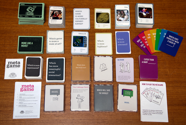
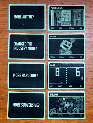
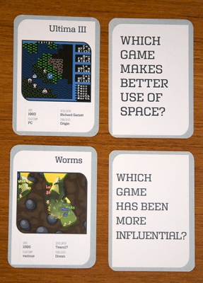
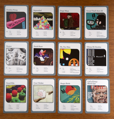
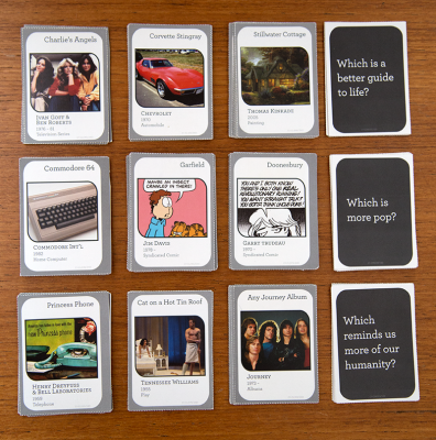
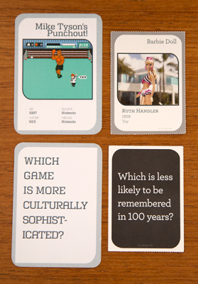
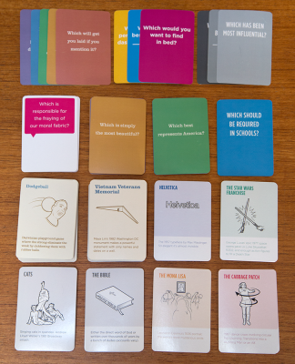
The challenge and pleasure of game design, for me at least, is the gap between my design and the experience—the fun the players have. We only have so much control of what shape that fun will take. Take the card game The Metagame I worked on with Local No. 12. We designed the two decks—culture cards and opinion cards—and we’ve designed ten different games that people can play with the game. So the rules, the things each game asks the players to do with the two kinds of cards, these are the mechanics of the MDA framework.

What happens when people start to play? That is the dynamics. Players pick which game they want to play, they pick the arguments they want to make, they size up their fellow players to think about what they like and how they think so that they can get their votes, they think about their understanding of the culture cards, and the possible arguments they can make. Sometimes people play it to be funny. Sometimes play to show off their smarts. Sometimes people get serious about it. Sometimes they get naughty. That’s up to them. The rules we designed create the space for a variety of dynamics to emerge. And that they do. These are the aesthetics: the place where our design is activated, and an experience unfolds.

Ripple 1: play + fun
That is the first ripple of game dynamics: what happens when players first encounter your game, and the experiences they have with it. This is that formal “fun,” or aesthetics layer. This is where we stop all too often when we think about the design of our games. But play goes so much farther than just a formal principal. This is treating our work like old musty paintings that hang on a wall of a museum, with no connection to life.

As The Metagame shows, there is no such thing as a purely aesthetic experience, there is no perfect “magic circle” within which gameplay happens. We don’t leave the rest of our experiences behind when we play a game, and we don’t leave our play behind we exit the game. The Metagame would break if this were the case, as we’d have no opinions about Comic Sans, or Lasers, or Journey, or for that matter, gender.

Ripple 2: play styles
Of course, there aren’t just the dynamics that emerge from our designs. There are the dynamics that emerge from how players like to play. We can design for certain play styles, but we can’t make players play our games in a certain way. Dungeons & Dragons is a great example of a game that can support any number of play styles. To John Romero, D&D was a playspace that begged you to battle and adventure. For Rand Miller, D&D was a playspace that invited storytelling and discovery. Both were play styles  were supported by Gary Gygax and Dave Arneson’s design.

This is the second ripple of game dynamics: the play expectations people bring to our games. This is still a formal ripple, one that has to do with the aesthetics of the experience, and doesn’t necessarily touch on the real world. People bring their experiences and their desires to bare on our games and the play experiences they can provide. Sometimes these happen to coincide with what we intended, as with D&D, and sometimes, not so much.

Ripple 3: semantics of play
What happens when we think about what our players bring to the creation of play dynamics? This brings us to an important idea for game design: the semantics of play. I’m borrowing this phrase from the artist and game designer Matt Adams of Blast Theory, a group of English artists. The design of games creates meaning which is interpreted through people’s prior experiences and their desires for their play experiences. Because of this, games can take on unexpected meanings that push against your intentions. That’s a complicated thing for many of us in games, imagining how others might interpret and respond to our games. Just because we design a particular set of goals doesn’t mean that will contain or constrain what people want to do with our games. This goes beyond play style, to more complicated ideas.

idhideyou

Let’s look at a Blast Theory game, I’d Hide You. There are three “runners.” The runners moved around Manchester with their camera devices streaming live video feeds back to the game players. Online players track the three runners on a map, and can see what the runners are capturing through their cameras. The online players give advice to the runners about where to go, and how to encounter the other runners. Whenever the runners were in camera shot of one another, the online players could snap shots to “capture” them and score points. Further, the runners can ask passers-by for help, in the process, if only briefly, bringing the public into the game, too. So now we have the runners, the online players, and the general public, each bringing different experiences, different frames of reference and levels of engagement in the game, all at the same time.

The meaning of the play experiences for the three different players all demonstrate the third ripple of dynamics: The often-unintended interpretations of our games. Each mechanic we design into our games is a prompt for action. “This is a thing I get to do. What does it mean? Why do I want to do it? How does it relate to the rest of my life?” The goals of our games focus players attention only so far. We all bring different value systems, which influence what we are drawn to, offended by, feel prompted to respond to, in all sorts of impossible to predict ways. Things start really getting out of the control of the designer at this point.

Ripple 4: games as culture
What happens when games take root in culture? What happens when they become a phenomenon unto themselves? Games like Starcraft, Johann Sebastian Joust, Super Smash Brothers, Cards Against Humanity: they all take on lives of their own, far out of the control of their designers.

Basketball is a great example. These are the original rules of Basketball, written by Joseph Naismith back in 1891:

rules-of-basketball

The original rules did not allow players to run with the ball, so passing was the only way to get the ball closer to the basket for a shot. Naismith’s goal with the game was to keep young men off the streets and keep them occupied during the winter. Within a few years, the basics of the game that we know today were in place: dribbling, passing, the hoop and backboard.  Basketball spread like wildfire, so fast in fact that some thought it was a troubling development. It moved well beyond the keep young men occupied.

DrJ_scoop

Eventually, we end up with something like this, some 100 years later. Dr J finds a new wrinkle in the game no one in the preceding 100 years had realized you could do. The amazing thing about basketball is there isn’t just one version of the game. There are hundreds of basketballs. Once the game becomes part of culture, once it is out of the developer’s hands, the game becomes everyone’s and not just the developers. There’s streetball, HORSE, women’s pro, college ball, old man pick up ball, and on and on. It is a game, it is a spectator sport, it is a way to cheer for your town or school or nation.

This is the fourth ripple of dynamics that emerge from our games: What happens when our games become culture. The moment our games are in the public, they become theirs, not ours. They move from our initial prompts for actions and go in all sorts of directions, imposing their own uses on our games.

Ripple 5: culture reflects back
What happens when culture ripples back onto games? What happens when beliefs and behaviors seep into our games? The very idea that we think of games as systems is an example of this: the most basic framework for designing games is derived from a set of tools designed for understanding and fixing business systems.

One of its more pervasive offshoots of systems dynamics in our culture is Game Theory. Game Theory is the use of mathematics to understand human behavior. It was popularized by John von Neumann as a mathematical tool for analyzing the decision space of zero-sum games. At the crux of game theory is the assumption that “rational actors” will always act in their own best interest. This line of thinking was used to develop U.S. Cold War strategies, including the SAGE computer system developed to monitor Soviet activity. What is interesting here is the desire to imagine humans as rational logic machines, and not as people. There is a lack of empathy deep in the heart of game theory, even a distrust of people. The assumptions of Game Theory are that we want to win, to beat everyone else in a zero-sum, winner-take all game that is life.

John Nash, the mathematician made famous in the movie, A Beautiful Mind, was infamous for designing cruel games that pitted people against one another in zero-sum games that rewarded selfish play—the assumed baseline of game theory. One of his better-known games was So Long Sucker, better known as “Fuck You Buddy,” for reasons that become clear if you’ve ever played it. Game Theory and its views of the world bled into all aspects of life, including games themselves of course.

The culture of games always being about winning and “beating” a game emerges from this zero-sum mindset. We have internalized this thinking, and often take it as a given in the design of our games.  We see similar ideas playing out in games like Shark Tank, where business is treated like a single goal game: extracting profit. There is no value here in providing employment, or having products that enrich lives. Only money, and profit at all costs. Total bottom-line thinking.

Back in the land of video games, we find other values reflected. Like that it is OK to represent women as objects of desire, rather than as sentient creatures. There’s this thing called the Bechdel Test applied to film to see if women are being treated well:

Dykes_to_Watch_Out_For_(Bechdel_test_origin)

God help us if we applied a similar test to games.

This is the fifth ripple of dynamics that emerge from our games: When culture ripples back onto us, influencing how we make our games, and the meaning produced when players play our games. The assumptions we make and the baggage we bring into creating our games that inevitably end up in the games. And so in turn, influencing the dynamics that ripple out of our games into the lives of our players and into culture as a whole.

It’s never “just a game”
So this is the main thing I want us all to be aware of: We need to be accountable for the dynamics that emerge from our games, and for the assumptions and values that we put into our games. We can’t simultaneously say games are important and a vital art form and say that “it’s just a game” when people challenge the violence and misogyny in games.

We don’t get to have it both ways. Either we own up to the place games occupy—sports, board- and cardgames, and videogames alike—or we accept games’ status as mindless entertainment widgets for emotionally stunted boys. Part of this is taking the design of games seriously, and recognizing their place in life and culture. We tend to want to stop at the abstraction, and delight in the formal and experiential qualities. While those are where the aesthetics lie, it isn’t where things stop. That’s just where the dynamics begin.

Rendering Meaning: On the Intersections of Visual Style, Interactivity and Gameplay

The following essay is based on a talk I gave on February 6 at College Art Association’s annual conference. It was part of “The Visual Politics of Play: On the Signifying Practices of Digital Games” organized by Soraya Murray. My talk wandered off the panel topic a bit, looking more at the challenges of critiquing games that fall outside traditional gameplay expectations.

—————–

Over the last few years, I’ve increasingly felt the need for a more inclusive aesthetic framework for considering videogames. More specifically, I seek an aesthetics that takes into account play experiences that go beyond typical player expectations: the pursuit of goals, the exploration of the space of possibility in a game, and winning, and so on. Some of this thinking is captured in my book, Works of Game, released last year, and Fun, Taste & Games, a book I’m currently writing with David Thomas.

Today, I would like to set out on a new path within this project—exploring evaluative approaches for games where the play emphasizes sensory, thematic or affective experiences that bend and break videogame tropes. I’ve picked three games to use as case studies today—Tale of Tale’s Sunset, Cardboard Computer’s Kentucky Route Zero and Eddo Stern’s Vietnam Romance. In each case, the gamemakers combine videogame technologies and game design tropes with literary, film and visual art strategies to create sensory-driven play experiences.

Sunset
Sunset
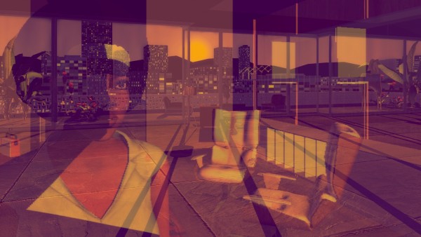
First, Tale of Tales’ Sunset from 2015. The player guides Angela, an ex-pat African-American woman living in a Latin American country roiled in civil war. Her job is your job: housekeeping for a wealthy man. The game consists of 44 late-afternoon visits to the apartment. Each day, Angela is given a set of tasks to accomplish—unpack a box, clean the kitchen, wash windows, vacuum the floor. The player has until the sun sets each day to complete her tasks. At the end of the visit, Angela returns to the elevator, and the game advances to the next housekeeping appointment.

The game is played from a first-person perspective, meaning we never really see Angela outside her reflection. We never see the owner of the apartment either, leaving the apartment itself and the city outside its windows as the primary visible characters. The carefully-designed and decorated 70s bachelor pad Angela maintains is represented in a “videogame realist” style balanced between game engine realism and a sculptural stylization just this side of the uncanny valley. The environments and objects—pillows, plants and rugs alike—all have that hard-surface look of 3D, belying their creation by meshes overlaid with images. In contrast, the perfectly-emulated cinematography of the game engine reveals a world awash in warm, dusty sunlight. This sets up a visual tension—the stylized, quasi-realistic modeling of the world is viewed through photo-realistic cinematography where light refracts just-so off polished furniture, and ghostly reflections shimmer in windows.

The play experience of Sunset operates in a middle ground of audience expectations. It is presented in a typical first-person, three-dimensional manner that suggests real-time engagement in which the player sees through the character’s eyes, and by extension, performs in-game tasks as the player. But in Sunset, the player navigates Angela to the room where the task is to be completed, and once the player locates the site of the task, she simply has to click on the appropriate space or object, and the task is complete.

Instead of transposing the act of sweeping or plunging or washing into actions performed with a game controller, the player simply clicks, at which point the view shifts to the glimmering evening sky as the clock shows time rapidly passing while the task is presumably performed off-screen. This can be read as Angela’s own focus during her chores—she tunes out and daydreams, with little active mental attention required to carry out tasks she has done over and over during her time as a housekeeper. The extra-mimetic nature of the interactivity also relocates the core play activity from performing intricate tasks to moving and seeing. In the realm of 3D games, the acts of seeing and moving are so commonplace as to not be considered game actions; in Sunset, this extra-mimetic treatment of the tasks the player is asked to perform shifts the focus of the experience from goal-completion to a more atmospheric story experience.

There are two additional “videogame easy” actions available to Sunset players—listening and examining objects. As Angela rides the elevator up to the apartment each day, she receives her list of chores, while we hear her thoughts, which tend to focus on snippets of current events relating to the war, and details from her own life and that of the apartment owner. Angela encounters various objects as she moves around the apartment—magazines, records, artworks, papers. Some of these objects trigger additional commentary by Angela, here presented as text. Angela’s verbal and written commentary become the primary vehicle for backstory and interpretation.

Despite the goal-oriented premise, Sunset is more atmospheric than mechanical, and more concerned with a sound and audio-driven story experience than goal-oriented achievement. This is a far cry from most videogames set in times of war—instead of focusing on combat, Tale of Tales looks at how a time of conflict impacts the quotidian.

Kentucky Route Zero
KRZ_conclusion

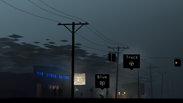
The second game I’d like to look at is Cardboard Computer’s Kentucky Route Zero, a game in five acts, the first three of which were released in 2013 and 2014. The game augments the traditions of the point-and-click adventure game genre with a keen cinematographic eye, while stripping away the puzzles typical of the genre. Players follow Conway, a truck driver, as he attempts to deliver antiques in the backroads of Kentucky. As was common for point-and-click adventure games, scenes are presented as deep-focus middle shots that establish context and characters, and are the stage on which scenes unfold. Moving Conway, and on occasion, other characters, is the core interactivity. Typical for the genre, this is accomplished by clicking on the place the player wants the character to move.

Much of the game’s beauty comes from its visual and cinematic style. Flatly colored, stylized figures, objects and spaces are composed from planes of geometric color, together generating a flat, two-dimensional pictorial space. The only nuance and shading comes from the lighting sources, which also provide the primary indicators of depth in the environment. Though subtle, the camera work is precise, feeling more like carefully composed cinematography than what we might expect from a point-and-click adventure game. This happens largely through the decoupling of the camera from the player, allowing a more deliberate composition, framing and movement.

The camera movement also suggests a depth in the seemingly two-dimensional world. The game is indeed three-dimensional, organized along a series of planes within a shallow stage-like space. The camera tends to track Conway’s movement and the action in general—panning left if he goes left, zooming in slightly if he moves away from the picture plane, tracking him if he moves upward. The camera movement causes parallax effects that give the game a quiet cinematic lushness.

Changes in scene are indicated by small directional prompts. The typical design decision would be to allow the player to make these changes by clicking on a door or ladder or otherwise abstract the passage from scene to scene through an in-scene interaction, like clicking on the door to indicate Conway should pass through it. But in Kentucky Route Zero, these choices are moved into super-imposed interface elements.

Similarly, there are interface prompts for three additional activity types: “look,” which provides a more detailed written description of a person, object or animal; “talk,” which opens text dialog trees; and “use,” which can mean different things depending on the item: pick up, drive, turn on, and so on. The text trees through which conversations and verbal actions occur are the source of much of the story progression. Decisions are made, situations worked through, backstory explained, and most importantly, the main through line—Conway finding his way to his delivery destination—unfolds through these conversations.

The most curious of these is “looking.” Instead of allowing the player to zoom in on a detail, something fairly commonplace for examining objects in games, players are instead given a written description. Often, the description fills gaps in the level of visual detail—letting you know a chair is a Queen Anne, or the condition of Conway’s dog’s hat. Other times, these indicate activity.  These descriptions are presented parenthetically like the stage direction one might find in the script for a film or a play. These descriptions also deepen the style and tone of the game tone.

These two devices—overlaid selection menus and the use of text for description and dialog—engages the player while keeping them at arm’s length from the story and characters. We never become Conway, even if we get to decide where he walks and what he says. We are participants in establishing the tone and tenor of the game, but we are not an actor within the game.

Unlike many videogames, Kentucky Route Zero has no pretense for immersion, instead opting for absorption. Most everything about the game establishes a carefully-controlled play experience that can be like the best of film or literature—allowing the player to become absorbed by the authored experience.

Vietnam Romance
Vietnam Romance

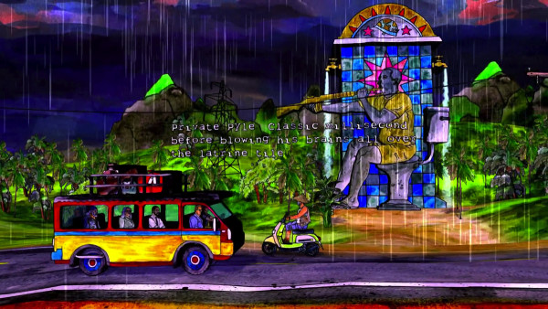
The last game I’d like to look at is Eddo Stern’s Vietnam Romance, a game still in development, though it has been displayed on several occasions including a solo show at Postmasters in New York this past summer. The current state of the game is a series of nine vignettes, primarily constructed from the conventions of side-scrolling games—driving a car, flying a plane, shooting an arrow at a distant deer, catching objects thrown from a vehicle ahead on the road, and so on.

Woven through the scrolling levels is a collectible card game. The cards represent the resources necessary to carry out the actions of the game. The play experience then unfolds as the player navigates while pausing on occasion to collect, examine and “play” cards.

Early in the game, “If you hated the War but liked the Movies, you’ll love this Game!” scrolls across the screen. This seems like a glib joke, but it is key to making sense of the game. Vietnam Romance is a playable meditation on American cinema’s romanticization of the Vietnam War.

The most striking thing about Vietnam Romance is its visual style, and how it is creates the play space. The graphics are all hand-created watercolors mapped onto extruded shapes. This creates a sense of depth with the overall effect of watercolors affixed to black foam core arranged on flat planes receding into the middle distance. The clearly hand-made style created from saturated colors create a striking play experience that feels less like a videogame than a playable diorama.

It may well have been easier for Stern to use a more realistic, three-dimensional style, but that would have likely led to the game reading as a typical war simulation. And so the watercolored diorama creates a necessary distance, allowing us to consider a different aspect of war.

Similarly, the move away from first-person aiming and shooting or the strategic deployment of military forces are set aside for set pieces inspired by films like The Deer Hunter, Full Metal Jacket and Apocalypse Now and the Vietnam War tourism phenomenon.

The activities in these set pieces vary widely—puppeteering a Nancy Sinatra-meets Full Metal Jacket dancer; taking an aging Rambo-esque fellow deer hunting; catching playing cards thrown from a ox-drawn cart; shooting letters out of karaoke lyrics, and so on.

The curious thing about some of the set pieces is their pressure on player skill. Many require a mastery of videogame actions. For example, the opening driving scene becomes a resource management puzzle to keep the beaten up car from overheating, while the deer hunting scene demands a keen spatial understanding coupled with precise trajectory calculation. These are akin to carnival games, as they test the player’s skill, but ultimately do not thwart the overall play experience—the player can simply give up, and resume the vignette, or return to the menu to play a different vignette. The game becomes an amusement park cars-on-a-track ride exploration of videogames and American cinema as much as it is a look at Vietnam War nostalgia.

Challenges for an inclusive aesthetics
Looking at these three games, we see different approaches to bending and breaking videogame genre expectations to create expressive play experiences that largely stay away from goal achievement and systems-driven interactivity.  This presents a challenge for analysis and critique: if these games meld sound, image, story and repurposed game tropes to construct play experiences, but ignore most all other expectations of videogames, can we still evaluate them using the critical language of videogames?

Even at their most inclusive, the theoretical frameworks of game studies and digital media can fall short. Take Janet Murray’s defining characteristics of the digital medium: procedural, participatory, encyclopedic and spatial. As Murray’s theory is generally interpreted and applied, the presumption is that videogames should push these properties to their logical extensions, meaning player interaction should lead to unexpected outcomes within the designed space of possibility. Sunset, Kentucky Route Zero and Vietnam Romance are indeed inside Murray’s boundaries, but they use the digital medium and videogame tropes for authorial expression that is light on interactivity as authorial agency.

This leads to the consideration of the importance placed on choice and decision-making. The concept of meaningful choices has long stood as a defining principle of game design. This perspective is best embodied in game designer Sid Meier’s definition of a game: “A game is a series of interesting choices.” which places value on players having an active role in determining the outcome of the game. From this vantage, Sunset, Kentucky Route Zero and to a lesser degree, Vietnam Romance, fall short, as there is a presumption that interesting choices give players systemic impact on the quality and quantity of the play experience.

This points to the value placed on games as dynamic systems. Videogames are approached as interactive systems within which players can tinker and pursue measurable outcomes. In these three examples, the systems dynamics tropes are for the most part replaced with structures of progression rather than emergence, to borrow Jesper Juul’s terms. For these games on the margins, it is necessary to see the systemic confluence of visual and aural elements, interactivity and theme and not just on state changes.

This suggests another early theoretical framework—Espen Aarseth’s nearly 20 year old theory of ergodicity. As Aarseth defines the term, “… nontrivial effort is required to allow the reader to traverse the text.” Aarseth’s example of trivial traversal is the act of reading a book—assuming one knows how to read, and is familiar with a given culture’s conventions for navigating pages and their sequencing, reading requires minimal effort, and thus is non-ergodic. Aarseth’s ergodicity has been broadly interpreted to speak to the player’s agency in shaping the game text through in-game actions. But in games like Sunset and Kentucky Route Zero, player actions are mostly the equivalent of reading and page-turning, at least from a vantage that privileges meaningful choices within a systems-driven space of possibility.

The reception and literacy side of these experimental works cannot be taken for granted, however. Each of these three games make demands on players that at once requires gameplay literacies and an openness for experiences partially outside videogame conventions. Tale of Tales’ Sunset asks us to understand and master the basic interface of a 3D first person videogame—look and walk. For gameplayers, these have become trivial, but for those who might have more affinity for the subject matter but aren’t gameplayers, this basic expectation is a barrier. Vietnam Romance is also instructive here—the deer hunter / Rambo vignette requires a surprisingly sophisticated ability to estimate distance and trajectory across a long distance. We find a tension point here for developing more inclusive critical frameworks—one player’s nontrivial is an another player’s rote and commonplace.

If we re-orient our focus toward a more experiential set of player choices, the real value of these games becomes clear. Aarseth uses labyrinths and mazes to tease out the differences between ergodic and non-ergodic literature. Unicursal labyrinths involve movement through an ultimately linear path absent of decision points. Multicursal mazes require decisions at forks in the path which have a substantial impact on where the experience goes. The presumption is most ergodic texts are multicursal. In our three examples, they generally don’t present multicursal “meaningful choices” that drive toward goal completion or quantifiable outcomes with win and lose states.

But if we shift this from a valuation of a player’s exploration of a space of possibility to the experiential choices a player makes—peer out the window at the city sky, pat a dog’s head, wonder at amusements from a slowly moving car—these games present meaningful experiential choices within a unicursal play experience. Analyzing and critiquing games like Sunset, Kentucky Route Zero and Vietnam Romance requires we break from the systems-driven, goal-oriented evaluation of player activity. The roles of player agency and decision-making have to be re-located to support the value of lighter player impact and heightened authorial expression.

At this stage in this project, I’ve only scratched the surface in sketching out the issues in creating an aesthetic framework that values experiential play experiences, and I am raising more questions than I’m answering. Hopefully, though, I’m starting to reveal a path toward a more inclusive videogame aesthetics.

Conferences and sustainable diversity

Over the last six years, I have volunteered as the conference co-chair for the IndieCade International Festival of Independent Games. For those unfamiliar with IndieCade, it is a festival that brings together gamemakers, critics, companies and the general public for a weekend celebrating independent games. A rotating cast of co-chairs and I have put together the what used to be called the “professional conference,” now known as “think:indie” (the talks and panels at the Ivy Substation and the Foshay Lodge). Part of IndieCade’s mission is to bring more diversity to games—both in terms of the play experiences, but also those making the games. With this mission in mind, my co-chairs and I have worked hard to diversify the speaker pool. We’ve done a pretty good job of it, too: this year we have roughly a 3:2 ratio of women to men, approximately 25% people of color, and an even larger percentage of LGBTQ-identifying speakers. We’re nowhere near perfect on the inclusivity and diversity front, but we’ve done better than most, at least on the surface.

Implicit in my work with IndieCade was a belief that conferences—the talks, the panels and the interstitial moments of community—are vehicles for change. Looking back at the last six years, I no longer believe this is a meaningful way to sustainably support marginalized communities. And so I’ve made the decision to step down from my conference co-chair role, making the 2015 IndieCade conference my last in this capacity. I’d like to share some of my thinking on the intersections of diversity initiatives and conferences that informed this decision.

Within academia, conferences are central to the “publish or perish” existence, particularly the conferences hosted by the discipline-based professional organizations like the Digital Games Research Association (DiGRA) or the Association for Computing Machinery’s SIGGRAPH (Special Interest Group: GRAPHics). DiGRA and SIGGRAPH operate under a cooperative model where its members volunteer to organize the conferences as a way of sharing responsibility for a platform that benefits the field and individual careers alike. These conferences are either part of an established (SIGGRAPH) field or a growing disciplinary infrastructure (in the case of DiGRA) that helps sustain game studies, train gamemakers and allow basic research into the medium of games.

Conferences are so deeply engrained in many of us academics that I couldn’t help but assume they were a workable model for my communities outside academia. For me, a big motivation for volunteering my time to co-chair the IndieCade conference has been giving marginalized voices a platform to share their work. Events like IndieCade and GDC’s diversity track give these developers and critics a platform to share their work, but I fear these events are not providing sustainable, long-term benefit to those outside academia and game development companies.

Asking someone to speak at an event is asking for a lot more than just the hour of time on stage. There are the opportunity costs of setting aside work in order to prepare a talk, and of course the financial outlay to travel, find lodging and purchase food. Within academia, it is assumed that speakers will cover their own travel expenses and conference admission, sometimes with the support of grants, university funding and similar resources. But within marginalized communities of gamemakers, outside the academic and game development ecosystems, it is unfair to assume everyone can afford to take on the opportunity costs and financial burden of attending a conference. Even with the free conference pass given to most speakers, travel, lodging and food can easily eat up $1,000 or more for a weekend event. Over the last couple of years, IndieCade has made efforts to provide some financial assistance to conference speakers who need it, but it has been a token gesture at best, as we’ve only been able to cover a portion of the speaker expenses relating to travel, lodging and meals. I’m proud that we have made this effort, and applaud that IndieCade supported my co-chairs and I in trying, but it just hasn’t been enough.

Creativity competition reality shows like Project Runway keep popping into my mind as I’ve mulled all this over. Up-and-coming designers vie for an opportunity to compete for a “once in a lifetime” opportunity to showcase their work, and if they are lucky, gain the title of Project Runway winner. On a recent episode, Tim Gunn was consoling that episode’s loser by telling her “we’d hear from her again.” I started thinking back to previous contestants and winners from seasons past—had I ever heard from any of them again? A couple of previous competitors have ended up on other reality shows and Project Runway spinoffs, but I can’t think of any that have become well-known, established designers.

This shouldn’t come as a surprise. Nothing about Project Runway was designed to help the fashion designers establish a sustainable career. Instead, these programs exploit the designers for the purposes of television ratings and advertising revenue. And so when the season is over, the designers are often no better off than they were before appearing on the show. I’ve come to see developer-focused conferences in a similar light. Yes, these conferences have been part of making some gamemakers and critics “conference famous,” but beyond that, what are we doing to support them? By inviting a developer or critic to speak, are we doing them a favor? Or are we doing the organizations or ourselves a favor?

I’ve come to see sustainability as the most pressing issue for keeping the margins of indie games from fraying and leaving people more disenfranchised than they were before entering our communities. I’m not sure how this problem is solved, but I am increasing certain that developer-focused conferences can mask the real problems. This weekend was amazing, seeing such an incredible range of gamemakers all in one place, catching up with friends, getting inspired by the talks and games. Each year’s gamemakers is more diverse than the previous. It is hard not to feel connected and part of something important. But this can create a false sense of infrastructure. Yes, we have community, but we’ll all soon return to our daily lives. Academic conferences operate within the larger ecosystem of higher education, from which we can return to our jobs as faculty or our studies as graduate students. But gamemakers outside academia and game companies leave Culver City to return to… what, exactly? There simply isn’t an infrastructure there to provide a basic, sustainable quality of life.

So if conferences aren’t part of the sustainability solution, what is? I’m honestly not sure, but I have seen a few examples that may point the way. One thing IndieCade has done well over the last few years is create programming within the festival that fosters marginalized and up-and-coming developers. Two initiatives stand out. First is Intel’s “gaming for everyone” that brought many of the organizations working with marginalized game making communities to Culver City for the weekend. It was a truly inclusive space that gave exposure to these organizations. I hope Intel continues this, and broadens to other gamemaker events.

The second example is the indieXchange, a free event open to anyone who has submitted a game to IndieCade that year. Developers attend sessions on project management, design, marketing, business and legal. IndieXchange also provides access to publishers of indie-friendly channels. For those with an indie-as-small business mindset, indieXchange is a great opportunity. But this isn’t always a realistic or desired opportunity for many in marginalized communities; or if you feel strongly that you should give your games away; or if you are creating work that doesn’t fit the digital distribution models of Steam, Sony, Microsoft, Apple and Google; or if you are dealing with subject matter, themes or play styles that don’t lend themselves to broad audiences.

I think there are opportunities to provide similar programming for those approaching games in ways closer to art or poetry than small business development. In New York City where I live, there are two organizations doing this for artists that we can learn from—the Lower Manhattan Cultural Council (LMCC) and Creative Capital. LMCC runs a series of free or low-cost workshops to help artists—think poets, performance artists and experimental musicians—manage the particulars of careers based on producing work that doesn’t naturally fit within supply-and-demand marketplaces. LMCC workshops and programs cover everything from financial literacy to career planning to grant writing. These are essential skills for artists—knowing how to mange your finances and create a sustainable existence for oneself; learning how to establish goals for one’s career; understanding how to apply for funding to support the creation of your work. Developing similar programs for gamemakers operating outside the traditional production and distribution infrastructures is essential to creating an inclusive and diverse community.

Helping artists better manage their careers is important, but so is providing them opportunities to create their work. Creative Capital is a great model for this. They are more or less a venture capital fund for artists. Artists apply with projects that need financial support to be realized. Should the project ever make a profit, a percentage of the money returns to Creative Capital to continue supporting other artists. This is kind of like the Indie Fund, but without the expectation that the work will ever turn a profit. This sort of private sector support is essential to help those on the margins of games have the opportunity to make work.

Fellowships and residencies are a third method for supporting gamemakers that we can learn from. Organizations like LMCC and Eyebeam provide artists a space to work, access to resources and a community, and in some cases, stipends. These can be win-win programs, as the artists can create their work, and the organization and its community get to learn from the artist in turn. Outside arts organizations, universities and corporations also run artist in residence programs. Facebook, for example, has a residency program.

The catalyst for all these artist support initiatives is funding. We are starting to see some government support for games as an artform, but for things to happen, we need individuals and companies to get involved. For companies to really help in this area means doing more than simply sponsoring conferences. It means recognizing the importance of creating an infrastructure to support the medium and not just the commerce. We need non-profit foundations that see the importance of supporting games along the margins—not to help turn them into developers of saleable games, but to allow them to make games from the messy, fragile lens of art.

Intel’s $300 million diversity initiative has unparalleled potential to help with this; I hope they continue and set an example for other companies. On a smaller scale, there is NYU Game Center’s annual No Quarter exhibition that commissions games from four gamemakers. And there is IndieCade’s submission scholarships, which allow developers to apply for fee waivers when submitting their games to the competition. These efforts all matter, big and small, and we need more of them.

So while I’m no longer helping IndieCade organize and run its conference, I do plan to continue looking for ways to create a space for sustaining a diverse and inclusive community for game making. Perhaps this can happen through the IndieCade Foundation, maybe it will be through partnering with an existing arts organization. If you have ideas about how to make this happen, or you have the resources to help make this happen, let’s talk and see what we can do. Even better, start something on your own. The more people working to create ways to sustain the margins of games, the better.

Stepping down as co-chair of IndieCade is bittersweet for me. I want to thank Stephanie, Sam and Celia for giving me the opportunity to help shape the conference portion of IndieCade. I’ve personally gained a good deal as an IndieCade volunteer—met hundreds of developers, learned from the diverse range of games and play experiences discussed in the conference and exhibited within the festival, gained exposure for myself as a gamemaker and speaker, and so on.

Finally, I want to thank all the gamemakers and critics who have joined us on stage over the last six years. It took me a while, but I now realize how much we asked of you. I hope you gained half as much from the experience as we did.

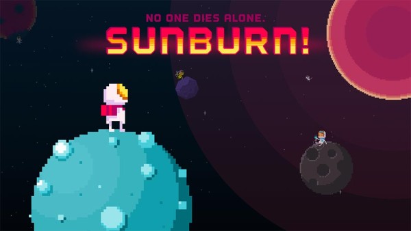
SUNBURN! and the giggles of death, in space

Sunburn! title screen

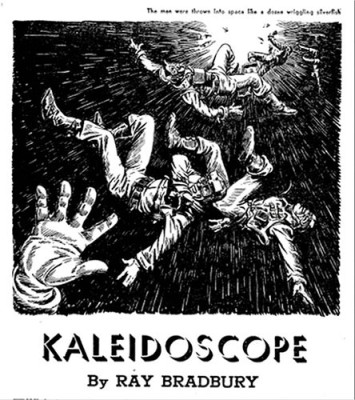
If we believe its developers, the game, SUNBURN! is an ode to the Ray Bradbury short story, “Kaleidoscope,” that first appeared in The Illustrated Man in 1951. Bradbury’s story opens in the moments just after a ship explodes in space, hurtling its passengers on divergent paths into the abyss. Everyone is left to contemplate their solitary death as they chat on their space radios, heading off to their deaths. They fight, lash out, weep, scream, reflect and generally contemplate their lives. Eventually, some of them come to reluctantly accept their fate.

cover, Kaleidoscope

SUNBURN! takes this basic premise and twists it around a bit. Instead of everyone drifting off alone and bickering into their headsets, SUNBURN! asks you to kill off your crew in order to uphold the death pact you all made—no one dies alone!. All of this happens inside a physics-y puzzle game involving tiny little pixel characters lost in space.

As I thought about the game, I’ve tried to sort through why it resonates with me. I’m not always the biggest fan of SCI-FI, with all the space marines and BFGs and all, but there is something fascinating about the genre, particularly the mid-20th century era in which Bradbury wrote The Illustrated Man. Science fiction was pulp, a genre-bound pop form of mythological explorations of philosophical and political concerns—humanist thought wrapped up in gadgets and costumes. Science fiction was a place where things like the meaning of life and the solitary nature of death could be wrestled with. I saw glimmers of this in SUNBURN! before I learned of its connection to Bradbury’s story—life, death, community, meaning, honor, values, bonds.

photo of Eugene Ionesco

SUNBURN! hits a nostalgia note for me, but not how you might think. I’m not a child of the NES or Gameboy or any part of the 8-bit and 16-bit eras, so it isn’t that. For me, SUNBURN! reminds me of Eugene Ionesco’s absurdist plays from the 1950s and 60s. Ionesco was a master at creating bittersweet humor from mundane situations turned in on themselves. Situations like a place where everyone turns into rhinoceros, or people have conversations about doorbells rung by no one, or rooms that inexplicably fill with furniture. Ionesco taught me that the commonplace, when reconsidered and put to work in unexpectedly absurd ways, proved to be an effective tool for thinking about the world around us.

SUNBURN! hits a similar note for me. The earnest, gleeful spin on tragedy and death tickles my absurdist funny bone. In the same way I love the absurdity of Ionesco’s The New Tenant and the way its characters matter-of-factly deal with a never-end stream of furniture over-filling their space. SUNBURN!’s captain and his crew likewise go about their business of carefully gathering together for one last leap into death. It is all at once sweet and stupid and cute and nihilistic.

One of the best ways to deal with unpleasant things, at least for me, is keeping occupied with simple tasks. Like washing dishes, or knitting or playing a game. And that is exactly what you get to do inside SUNBURN!—keep yourself busy with upholding important promises at the cusp of death. The game does this well I think. There are four basic gestures to the game—tapping to move your character, double-pressing to propel them, spreading to zoom in to see details, and pinching to zoom out to see more of the planetary system. I find myself getting quickly absorbed in these actions. I’m barely thinking about the fact I’m collecting my people to send us all to our deaths as quickly and efficiently as I can. We then all go into the sun, and the game gleefully celebrates that I’ve killed everyone, or kindly chides me for having left someone behind.

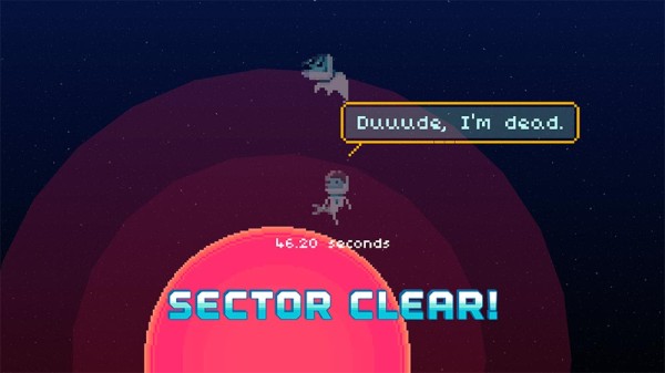
There’s a happiness in the apocalyptic vision of the game—in the cute graphics, the poppy color palette, the chirpy dialog. And a level of determination and stick-to-it-ness in the clever constraint-as-blood oath of “no one dies alone” at the core of the game. Everyone has an all for-one-one-for all attitude, even when left behind. And on the other side of death, after that act of abnegation driving the player character (which the other characters declaim, but don’t actively pursue, interestingly), the ghosts continue the peppy banter with comments about their afterlife.

"dude, I'm dead" screenshot

In a lot of reviews, this has been pointed out as naughty or darkly humorous, and I can see why people think that, but I think that sells the game short. It is like stopping at the wackiness of people with rhino heads and not getting to the real substance Ionesco was working over, or only gawking at the explosion in Kaleidoscope and not really taking in what Bradbury has to say. My read of the completion of a level—good or bad—is an underlying belief in humanity, not a “dude, that’s fucked up” sort knee jerk you might see on MTV’s Ridiculousness or on a 4chan board.

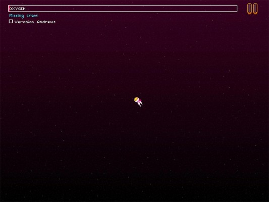
Screenshot of the captain alone in space

There is darkness under the chippy veneer of SUNBURN!, if you want to find it. Within the game, something that always brings the direness of the pixel astronauts situation, and I suppose, of the fucked up world around us, are those moments when I lose my direction, or accidentally mis-aim and start drifting out into space. You quickly get out of sight of the planets, and are left drifting with a real sense of direction, nothing to anchor you or suggest which way to aim to insure contact with a planet. All that focus on the task at hand—joining up with your shipmates—disappears as you are out in the void, maybe tethered to a dog or cat, drifting off to nowhere.

Jay Z + Thacker's In the Dust of This Planet

This sort of moment makes me think of In the Dust of this Planet — the first book in Eugene Thacker’s philosophical horror trilogy. Thacker looks at black metal, horror movies and other genre fair in order to tackle the existential ideas we traditionally associate with philosophy. In the process, he looks at the vastness of the world that is just over there, just on the other side of our efforts to remain preoccupied. Indeed, something is always just around the bend to remind us of our insignificance.

frontispiece, Shelley's Frankenstein

One of the things Thacker pursues in In the Dust of this Planet is a meditation on the limits of philosophy—it can only get so far on its own. Part of Thacker’s argument is that part of what the genre horror provides is a place we can explore things beyond the limits of philosophy. Take Mary Shelley’s Frankenstein. It is a critique of enlightenment thinking, a meditation on the natural vs. the scientific, on the limits of human ability to create and control the world, of unintended consequences and so on. All told through a fable of an ambitious doctor and his monster in the scary woods. While Frankenstein isn’t necessarily in the required reading list of most philosophy programs, it is a great example of how genre can probe the human condition.

Though it never dawned on me back in high school and college, I now realize Ionesco was an existential fellow traveler of Bradbury and Shelley. Both were probing around the edges of humanity or the beginnings of late capitalism through their creations. But where Bradbury had rockets and control panels and robots and science, Ionesco had the mundane and the everyday. Shelley uses fantastically morbid monsters made of body parts to explore the limits of science, Ionesco uses people turning into rhinos to think about conformity and fascism and shifting moral foundations. So sometimes we can turn to Hegel, sometimes to Shelley, or, if you believe me, Secret Crush, to probe the human condition.

You could say, rightly, I’ve heaped a lot of high-falutin’ baggage on a simple physics puzzle game—and its true, I have. But the limits of what we as gamemakers think games can do is far more limited than what we usually give the medium credit for. If we look past mechanics and goals, and follow the trail of where games might lead a person to ponder—kind of like I’ve talked about here tonight—we can start seeing the real value of games. Yes, games are culture, but not just in the sense of creating or nestling into cultures. They are also Culture in the sense of an Ionesco play, or a Thacker book of critical philosophy, or, bringing us back down to earth, a Eugene Levy role in a Christopher Guest film.

levy_feet

We could look at Levy’s character Gerry Fleck as a down on-his-luck, two-left-feet goofus who triumphs in a Revenge of the Nerds sort of way, because that is certainly there. We can also see him as a sweet fable—everyone has a purpose that eventually reveals itself, bravery in the face of chaos, and so on—packaged in a work of mocumentary genre fare. That’s also there.

Inside of genre-bound works, we can have our fun and our smarts, all at once. That’s something that SUNBURN! reminds me of, and I appreciate that about the game.  So thank you, Secret Crush.

The Author is Present

With anna’s upcoming exhibition, “the road to empathy” opening tonight at babycastles (which I interpret in part as a wake for dys4ia), it seemed like a good time to publish this essay. It is an in-progress excerpt from Fun, Taste & Games, a book I’ve been working on with David Thomas that we hope to release later this year.

—–

anna anthropy’s dys4ia, The Chinese Room’s Dear Esther and Zoe Quinn’s Depression Quest sit alongside a handful of other games that serve as exhibits in the trial-by-Twitter about what games are, can and should be. Much of the controversy relates to how the games are considered from the perspective of dominant ideas about game design. Particularly commercial games, the dominant presumption is that players have agency within the designed space of the game. This has become as central to evaluating games as the role of story is for film—films have stories, games have player agency.

How a gamemaker chooses to engage with the elements of game design—player actions and goals, the space of possibility for player performance, the visual and sound elements, the writing and the story—these are all design decisions. So too is the choice to not use these elements. Indeed, acts of omission are far more important decisions in the creative process than those about what to include. In music, it is the space between notes, the choice of which instruments to use and those to set aside. In film, it includes the decisions around which moments in the characters’ lives should be explored, and which should be left out. In painting, it can be the decision to work abstractly instead of using color and line to represent the world.

Expectations build up around mediums, and artists and audiences alike make assumptions about what ought to be part of works in a given medium. dys4ia stands as an example of a game that purposely resists and plays with our expectations. It is a game designer’s game; it belies a deep, intuitive understanding of the conventions of game design. It also plays with and breaks conventions to expressive ends. In an era when “game” stands in as another product category for disposable entertainment, dys4ia challenges assumptions. But in the context of personal work—Marjane Satrapi’s graphic novel Persopolis: The Story of a Childhood, Gob Squad’s experimental theater piece “Western Society” or Marina Abramović’s performance art piece The Artist is Present—the game also shows us a way games are like other expressive artforms. Like these works, the emphasis is place on authorial experience, not audience performance (even, as in the case of the Gob Squad and Abramović, there is audience participation).

dys4ia is not limited by traditional ideas of gameness. dys4ia isn’t an attempt to make us understand anna’s experience, or to make us more empathetic. The game is a way for anna to make sense of a particular moment in her life, and perhaps to share it with others with similar experiences. The player is separated from the game in two ways: the intimate yet alien act of playing within another person’s experience, and through the distance of time.

dys4ia is a work of ludic literature. It is a playable diary, as Paolo Pedercini and others have noted. Or, as anna probably puts it best, a game journal. Our role is not to play in order to make the moments our own, but to play so we can receive anna’s story. It is a story unfolded through play in the sense of mechanical engagement with an authorial intentionality we might align with poetry—most following poetry don’t view the works as “for them,” but rather created as an expression of the poet. To think of games as solely a space for player performance inside a design is to tragically limit games. dys4ia shows how an ever-present author is equally important. More than that, it is an ever-present author in a past moment. dys4ia explores anna’s experience before and during the game’s creation, in the same way a diary captures the time around its writing.

The game’s space of mechanical possibility is narrow. This makes sense, as the game is about anna’s experiences after all, not the player’s. When we play dys4ia, we aren’t role-playing or engaging with a rhizomatic play machine, nor are we exploring an imaginary place and its inhabitants. The vignettes are shaped more like memories or dreams than anything else—distillations of meaningful life experiences.

The game is composed of four chapters, each focused on a particular period during anna’s experience around hormone replacement therapy. The chapters contain a series of short entries or vignettes exploring a particular experience or feeling. The use of Warioware-esque mini-games to construct a series of ludic vignettes gives a flexibility within a structured whole. Within each vignette, anna could use the appropriate gesture while still letting it fit within the four-chapter structure. Sometimes, the vignettes reference games like Breakout or Ms. Pac-Man (or its many themed clones). Sometimes they borrow from matching games. The interactions performed by the player within each vignette illustrate a thought, an experience, a decision.

One of the more striking appears three times, once at the beginning, once in the middle and once toward the end. In the first instance, the player is presented with a puzzle piece, and a wall through which it must pass. Using the arrow keys, we move the piece along. At first glance, the piece seems like it won’t quite fit, even though it is exactly the shape of the hole. Careful navigation allows the piece to enter the gap, bringing up the first passage of text, “I feel weird about my body.” The role of the player in anna’s story is made clear, as is anna’s state of mind about her body. In the same way a comic artist might use metaphor to visualize an idea, anna uses an interactive gesture to illustrate a moment in her experience.

One of the things that first struck me about dys4ia was the clever dissonance between the graphics and the subject matter. The relationship between the visual style and anna’s story brings a poet’s sensibility to the game. The stylization of the people, places and objects brings clarity and focus, but also a particular feeling to the play experience. The same extends to the play itself. When we think of something as deeply personal and challenging as gender transitioning, bright, simple pixel graphics probably aren’t the first style that comes to mind. Lo-fi pixel graphics are more often associated with fluffy and ephemeral, not personal and painful. This stark contrast works well for the game, bringing clarity and force to anna’s conveyance of her experience. But it also speaks to the zinester community and its embrace of “craptastic” visuals and audio as a critique of craft and technology barriers keeping more people from making games.

The language in the game is kept brief and to the point. It is there to underline the ideas more than present them. I say this because the images and interaction often make the idea, event or experience clear. The text’s display is often used to give more nuance to the vignette and to serve as feedback on the player’s actions. In the first chapter, one vignette presents the player with a silhouette of anna trying to put on a tight-fitting shirt. “Girly Clothes” appears at the top of the screen, providing context for the player action—repeatedly clicking the down arrow to pull on the shirt. After a number of clicks, “don’t fit” appears at the bottom of the screen, emphasizing the point, but also confirming the player’s experience.

A couple years after dys4ia was released, I encountered another work of a woman’s experience with gender transition—Transgender Dysphoria Blues by Against Me!. Like anna anthropy, Laura Jane Grace, the band’s lead singer, used the album to express aspects of her experience with transitioning to openly living as a woman. Songs like the eponymous “Transgender Dysphoria Blues” operate inside the idiom of the pop punk metal-tinged subgenre. At first listen, if you don’t pay attention to the lyrics, you might not think anything unexpected is going on with the song. The lyrics, however, suggest otherwise:

You want them to notice,

The ragged ends of your summer dress.

You want them to see you

Like they see every other girl.

They just see a faggot.

Listening to the song as a whole, lyrics and all, you can hear frustration and pain conveyed in a way that came natural to Laura Jane; she works from a place of artistically familiarity—guitar-driven punk-inflected rock. But unlike much of the band’s earlier music, there is a heartfelt, personal feel to the song. Laura Jane works through her experiences, feelings and desires, but doing so in the form she knows best. anthropy’s creation of dys4ia strikes me as similar in many ways—an artist working within a medium she knows well to share her experiences.

One striking difference between these two works is how they operate within their given mediums. “Transgender Dysphoria Blues” as a song doesn’t depart from the style of Against Me! in any meaningful way beyond the lyrics. Being someone who doesn’t always pay close attention to lyrics, I’m not sure I even noticed the subject of the song at first. But with dys4ia, there is a reimagining of the form of games. anna composed from the materials of games—more often considered a form of entertainment—as a means of self-expression and exploration. In the process, she gave shape to something new: a game steeped in the history of games, but still unexpected in its use of the form.

Transgender Dysphoria Blues did create some controversy, but it was largely accepted and people moved on. The form of pop-punk was not the controversial aspect, after all. That dys4ia created (and continues to create) a ruckus speaks to the limited conception of games that we operate under. dys4ia, Depression Quest and Dear Esther continue to serve as mile markers in the maturation of games as a medium—in their reception and the way we think about what games can be. For me, they are clear signs of the medium of videogames broadening, becoming more flexible and embracing. That these games receive so much scorn is a sign that they have hit a nerve well worth striking.

The Road to Hell is Paved with Serious Games

Due to some poor planning on my part, I booked my flight home from the 2010 Games for Change festival for the same time I was supposed to be onstage speaking. Instead of trying to Skype in from 30,000 feet, I had a colleague help me record my contribution to festival’s rant session: “The Road to Hell is Paved with Serious Games.”

This week, Games for Change 2015 is happening here in New York. Over the last five years, the event has grown, changed locations and generally become much more of a “thing” than it was in 2010. Serious games, games for change, educational games and the other names we have for such games have changed as well. There are more game developers involved, and a wider range of companies, research groups, philanthropies, NGOs and government agencies are involved in conceptualizing, producing and funding this sort of game. As a result, the overall quality of serious games has improved.

Still, the core issues with serious games linger five years later. Some of my ideas about games have changed over the last five years, but the gist of my over-produced rant still resonates. Consider this an unsolicited reprisal rant for the 2015 Games for Change festival:

The Road to Hell is Paved with Serious Games from John Sharp on Vimeo.

How The Metagame cards went from a sports card-like to dictionary chic

Five years of Metagame card designs

Five years of Metagame card designs

Over the last five years, The Metagame has transformed from a conference game to a party game, from there to an artist’s project bound into a magazine and finally back to a rebooted party game. Along the way, the visual design of the game has undergone one major reboot, three format changes and innumerable small revisions. At each turn, with each change, the visual design of the game has always been central to the success of the game. This is the story of the game’s visual design over its five year evolution.


2010: The Metagame Conference Game
Local No. 12 began designing the Metagame as a conference game for the 2011 Game Developers Conference. This meant the cards had to work in a wide range of circumstances—people standing in hallways chatting, players seated before or after conference sessions, in the poor lighting of a bar, in parties at 3am. We also knew we’d be dealing with people who knew games inside and out. This audience already spent a good deal of time talking about games, so we wanted to think through how to present the game in a way that dovetailed into their existing interests and activities.

Mid-century baseball cards were a model for our early layouts

Mid-century baseball cards were a model for our early layouts

Early on in the project, we hit upon sports trading cards as a model. It made sense for the game in a number of ways. Since we were focused on videogames as the primary subject matter, the “facts + picture” model of trading cards worked well as a framework. In the case of baseball cards, the player’s name and likeness were the most important information, followed by their position and team. This suggested an information hierarchy for the Metagame game cards. We would feature the game’s title and an exemplary image, followed in importance by the publisher, developer, platform and date.

Summer 2010: the first playtested card design

Summer 2010: the first playtested card design

With this in mind, we began experimenting with the basic composition of the cards. We quickly came up with a design that included the game’s title, image and salient information for differentiating which particular version of the game was up for debate. We spent a lot of time thinking about what kinds of images should represent the games. We experimented with screenshots, game logos, even fan art. In the end, we used a mix of these to convey the spirit of the game, and to help those who might not know it identify the game. We liked a horizontal image orientation, which favored high-definition videogames, but also gave the cards a strong visual presence.

We began playtesting a horizontal design that allowed large images. During our first large-scale playtest was at IndieCade 2010, we quickly realized that playing cards are vertical for a reason—it is much easier for players to hold an ever-expanding number of cards this way. Just as important, that is what players expected from playing cards. So while we liked the look of the horizontal layout and its strong visual appeal, we realized we needed to revise the design to fit the format people were used to. This was a recurring theme in the design of the game—finding the right balance between the visual design, the communication design, the play experience and the traditions of card design.

Spring 2011: card layouts used at GDC 2011

Spring 2011: card layouts used at GDC 2011

We went through a series of additional revisions to slowly hone in on a look that read “trading card,” had a vertical composition, contained the correct information, and used a representative image that got across the gist of the game. Even after a lot of testing, we realized there were some problems with our design. For one, right-aligning the game titles didn’t work well with the typical way players fan out cards in their hands—the titles became partially obscured. So while it may have looked better to right-align the titles, it was more functional to have them left-aligned.

We also struggled with the “flavor” elements of the card borders. In order to maximize the size of the images and information, we pushed our borders past the ¼” safe zone recommended by printers. And as a result, the variation in cutting created visible inconsistencies that would have likely been hidden by a more generous border margin.


2012: Metagame Videogame Edition

2012: Illustrations for the Metagame Videogame Edition.

2012: Illustrations for the Metagame Videogame Edition.

The success of the Metagame at GDC 2011 lead us to run our first kickstarter campaign. We were overall happy with the look of the game, so we left the visual design more or less intact. We did make one substantial change to the comparison cards—we reversed out the text and background so the cards were white text on dark gray background. This gave the two decks more distinct looks. We also thought it gave the comparison cards a more cleaner, more designed look.

The main change came around the images on the game cards. Following the lead of collectible card games like Magic: The Gathering, we commissioned illustrations for each game card. We reached out to friends, colleagues and the internet to find a group of illustrators with a range of styles. We then let them pick from the list of games to pick their favorites. In the end, we had 20+ illustrators create the 100 images included in the Metagame Videogame Edition. These proved to be a real strength of the game, giving each card a distinct look within the more neutral look of the cards.


2013: Metagame Culture Edition

Fall 2011: Esopus #17 premieres “The Metagame (Culture Edition)”

Fall 2011: Esopus #17 premieres “The Metagame (Culture Edition)”

Later that year, Local No. 12 was approached by Tod Lippy of Esopus Magazine about doing an artist’s project. We quickly honed in on the idea of broadening the game to popular culture—film, music, art, literature, comics, architecture, fashion, product design, and of course, games. We also had to consider how to translate the game from a traditional card design to something that could be reduced in size to efficiently fit onto perforated sheets for binding into the magazine. So while the overall look-and-feel remained the same, there were innumerable design considerations around scaling down to a smaller, more narrow card size.

Regular-sized Videogame Edition cards on the left, the smaller Culture Edition cards on the right

Poker-sized Videogame Edition cards on the left, the smaller Culture Edition cards on the right

One substantial change was to change the text on the comparison cards to upper/lower type instead of all caps. We felt this gave a greater elegance to the typography. On the culture cards, we also removed the labels for the creators, date and medium. Given the wide range of content we were working with, there wasn’t the same consistency as before. This also freed up some much-needed space in the smaller card footprint.


2013 – 14: The Metagame reboot

Summer 2013: roughly 25% of the tested prototype designs

Summer 2013: roughly 25% of the tested prototype designs

Working on the Esopus Culture Edition got us excited about doing a commercial release of the broader culture edition of the game. We started by opening up everything about the game for conversation. Who will be our new audience? How would they best receive the information about the objects on the culture cards? How should we represent the objects? What will set the right tone for a broader audience?

We spent a good deal of time thinking through the pros and cons of photographs and illustrations. We eventually agreed on illustrations, and even more specifically, a single illustration style. We thought this was a good way to move away from the expectations of collectible card games, and toward a more mainstream approach to card game design.

Some of the more important conversations about the card design were with Max Temkin from Cards Against Humanity. He urged us to think about simplifying and streamlining the information on the culture cards in order to make them more accessible. This led to a long period of design explorations, prototyping and playtesting. We went through at least two dozen iterations that experimented with the arrangement of the elements, the typography and color palettes. For most of these, we produced prototype decks for playtesting and feedback.


2015: The Metagame.

Fall 2014: The final design for The Metagame cards

Fall 2014: The final design for The Metagame cards

After months of testing, we landed on the art direction for the game. We honed in on an approach to the culture cards that we think of as “dictionary chic”—a clean sans-serif, a pink accent color (a holdover from the original logo) and dark gray illustrations and descriptions. The opinion cards are all-cap white sans-serif on one of six colors. This rainbow of color provided the pop needed to brighten up the game.

Even with the art direction determined, and our first public images posted on our Kickstarter campaign, we continued to tinker with the point size of the culture card titles and text, the line breaks of each description, the color palette of the opinion cards and the colors of the card backs for the two decks. To insure they worked as stand-alone designs and functional playing cards, we ran dozens of playtests to see how players responded to the art direction and how well they functioned in a variety of contexts (conferences, bars, coffee shops, schools, kitchen tables, etc.).

We then entered the lengthy process of making sure our design translated cleanly to print: paper samples, press proofs, production samples (oh, so many production samples). Given the quiet nature of the design, getting all the details right were important: making sure the box was truly white, getting the alignment of the cards as consistent as possible, Making sure the opinion card fronts and backs were consistent in color, etc.

Looking back at the two conference games, one artist project and two boxed versions of The Metagame, we’re proud of our little game. With each change, the game’s visual design has gotten tighter and more focused. We hope you agree The Metagame—what we think of as the canonical version—has turned out well.

Mediums, Media, Culture and History

Albrecht Dürer, The Ravisher

Albrecht Dürer, The Ravisher. Baillieu Library Collection, The University of Melbourne

Last night, my Twitter feed burst with anger about The Entertainment Software Association’s position on the preservation of “abandoned” videogames. Apparently, the ESA, the trade association of the major videogame publishers, believes the preservation of “abandonware” videogames—games that are no longer supported, manufactured or otherwise published— is a form of hacking. And, in the ESA’s eyes, all hacking is a form of piracy.

Perhaps the greatest irony here is the use of the term, “hacking.” The logic I’m sure is to play on the negative connotations around black hat hacking—the kind that leads to databases full of credit cards being stolen and Sony’s email littering the internet. Hacking used to not mean internet malignancy, not by a longshot. Back in the 50s and 60s, to hack was to do something new and cool with technology—“expensive typewriter” was an early hack to make massive mainframe computers function as a typewriter, for example. It is this flavor of hacking that led to the creation of the earliest videogames. Spacewar!, for example, was a 1962 hack of the Digital Equipment Corporation’s PDP-1. Steve Russell and his friends built and iterated on the game, slowly pulling together their dogfight-in-space game. Before Spacewar!, there was Tennis for Two, Willy Higginbotham’s 1958 tennis game hack of an analog computer designed for simulating missile trajectories. And in 1952, A.S. Douglas created a Tic Tac Toe hack, OXO on the EDSAC. The big difference between mid-20th century hacking and the sad state of affairs today? Tic Tac Toe, Tennis for Two and Spacewar! were all created outside the confines of intellectual property laws and the tangled mess that is media-based creativity.

This is not a new problem. For as long as there has been mass-production, there have been attempts to protect creative work. The oldest example I know is from the early 16th century—the German artist, Albrecht Dürer. Dürers paintings were works in the medium of painting, while his prints were a form of proto-mediamass produced image products. His paintings were part of the ongoing dialog amongst Dürer, those who commissioned paintings from him, the institutions in which the paintings were hung, his fellow painters, those who wrote about his work, etc. In other words: the cultural infrastructure that swirled around his work. If you look at a book about the Northern Renaissance, youll quickly note a few things: there were only a few viable subjects (e.g. the Virgin Mary, baby Jesus, saints, portraits of the wealthy and powerful); many of the works are incredibly similar in composition, size color palette, painting technique, etc.; and Dürer seemed to be a trendsetter and follower all at once. This is how material culture always works: there are conceptual, formal and experiential expectations around what a medium is and isn’t good for (I talk about these ideas in more detail in the first chapter of Works of Game).

Dürer was nothing if shrewd. He was quick to adopt printmaking as a new outlet for his work. In printmaking, the artist found both a new audience and a means of self-promotion. He could create prints based on his paintings in order to spread word about them, and he could create original prints that could be sold to a less affluent audience. Soon enough, copies of his prints began to appear on the market without his authorization. He was outraged, and sought to protect his work and, in today’s terms, his brand. What we see happening with Dürer was the transition from a medium to media. Painting was a medium in the same way as sculpture and drawing. Because of the resources, time and skill it took produce a painting (or sculpture or drawing), copying was a concern. But with printmaking, where a single image could be reproduced hundreds of times in short order, the dissemination of works was much easier. Printmaking was a media, and therefore changed the ways artists thought about the intellectual property of their work.

Fast forward to the mid-to-late 20th century, and we see what in the past we might have called a medium immediately transform itself into media—software. Certainly, software wasn’t the first medium born into media status (film, television, radio), but the change in perceptions of software were swift and fairly merciless. By the 1970s, barely a decade into the commercially-viable life of computing, software was already a widget to be up-sold with computers. (Walter Benjamin’s “The Work of Art in the Age of Mechanical Reproduction” is a much more detailed and insightful exploration of the role of technology in changing perceptions about media. And McLuhan certainly has things to add on the subject as well.)

The main concern here is that the operations of creative culture, including the media products created by the members of the Entertainment Software Association, don’t really operate cleanly within the confines of intellectual property and copyright law. These things in fact push against the traditional ways culture is produced. It is a cycle of creation, inspiration, creation, inspiration, and on and on. A clear articulation of this is found in Kirby Ferguson’s “Everything is a Remix” series. Videogames are no different. Think no farther than the genre similarities we see with action-adventure games (who all seem to star variations on a unshaved white guy theme, or shooters with nearly interchangeable weapons, maps and bad guys). It is how culture works. The same happens with movies: how many super heroes will save the world and aging white guys will rescue their daughters this summer?

When trends and mediums pass, history becomes the way we preserve and remember what has come before. Often, this ends up feeding back into the current culture. Subculture fashion is an obvious example—80s recycling of the 50s, 90s recycling of the 70s, 00s recycling of the 80s, 10s recycling of the 90s. Videogames, particularly indie videogames is another, with the insatiable love for NES-era graphics and the never-ending stream of golden era arcade reboots. Videogames in particular and software more generally are challenging to preserve. Unlike Dürer’s paintings, you can’t simply put them up on the wall under controlled lighting and humidity and call it a day. The games require their platforms, period monitors, the parts to keep the platforms running, etc. For institutions like the Museum of the Moving Image and the National Museum of Play, which try to present games on their original platforms, there is untold work and expense to pull this off. It is easier to preserve the ROMs from old games that can be run on emulators. That’s what we had to do when we exhibited Spacewar! in the “Video Games Blast Off” exhibition at the Museum of the Moving image, as it was simply too costly to have a functioning PDP-1 (only one known in operation out at the Computer History Museum, itself made out of the parts of three machines), so we worked with a preservationist to create a facsimile of the computer’s hardware, and ran an emulator for game play. (Every other game in the show ran on its original hardware.)

But beyond the challenges in preserving videogames and their platforms, there is the lack of support around this work. Much of the cultural heritage field (e.g. art museums, the Smithsonian Institute, the Library of Congress, archeological and anthropological institutions, etc.) is viewed as important and thus worth the resources necessary to conduct the important preservation and historical research. Software preservation is far behind that of many other forms of material culture preservation, largely because sufficient philanthropic and public money isn’t being directed toward the ongoing efforts.You would think ESA would provide money toward these initiatives, or encourage its membership to do so. But thus far, that hasn’t been the case.

Given this, the bulk of the work to preserve the history of videogames comes from fan preservation efforts. These efforts rely on passion, disposable income, eBay, and more often than not, ROMs and platform emulators. And this is what the ESA is calling hacking, and therefore piracy. 

I realize I’m deeply biased in my opinions about the importance of material culture histories, but I find the ESA’s position to be ridiculous, callous, and so clearly about the profit margins of its membership that it barely merits mention. And if I think about it for a moment, there is nothing surprising about this. The videogame industry is deeply uninterested in its past for any reason other than mining the nostalgia of its fan base for profit. Though the fans place emphasis on the videogame portion of “videogame industry,” the companies producing the games clearly put industry first—they might as well be selling razor blades. For the large companies paying dues to the ESA, a game on an obsolete platform is irrelevant. Why care about something that can’t be monetized? Or more importantly, why allow anyone to play it until the port to the current generation of platforms is complete? The more easily players can access ROMs for abandonware, the less profit potential there is for the release of games on Steam and iOS.

This model is nothing new. Disney perfected it with the periodic re-release of its classic animated films, and the tightly-controlled release in emerging media and platforms. Disney, however, is wise enough to see the value in letting cultural heritage professionals do the work of preserving Mickey, Minnie, Cinderella and all those cats, dogs, mice and other creatures. Let’s hope the ESA and its membership eventually wake up to the fact they produce culture, not just products, and that they benefit from the preservation of their products by allowing them to be preserved and studied. 

Theme by Pexeto